console.log for the mind
low friction input
dense visualization
Personal Data Logging with Analytics
01Three measures
Let’s make an app to track energy.
Let’s make it a rating 1–5, with a timestamp.
Let’s use five circles, dark red to bright yellow. Tap one to log your level.
Each rating lands on the timeline as a colored dot:
Now let’s add mood — not a happiness score, an emotion. Not a range. One of five:
Now we have a timeline for mood:
We should add activity. That can be solid rectangles:
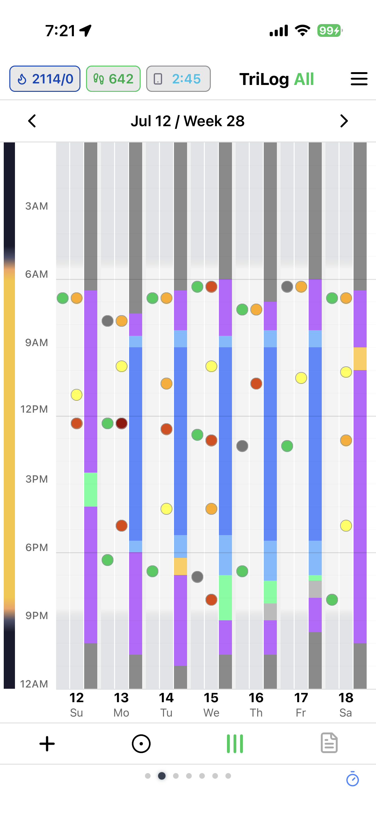
Now you’ve got three tracks:
You can fit a week’s worth if you turn them vertical.
Looks like this:
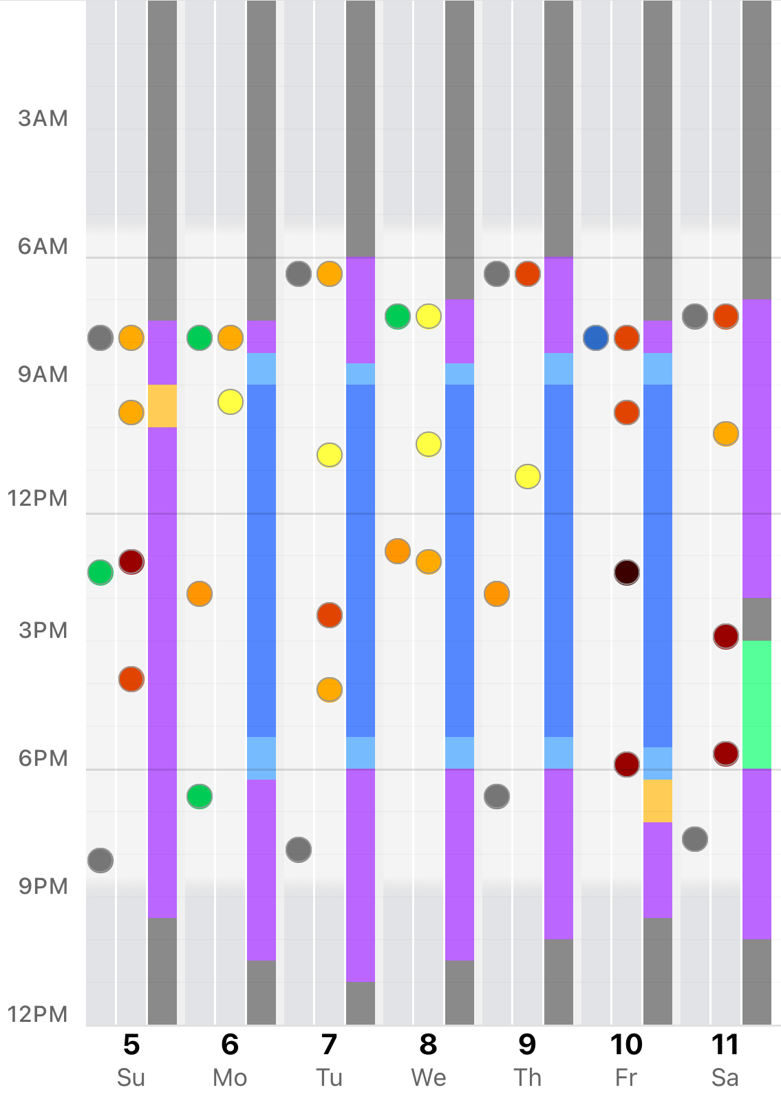
We added some shading to show daylight hours.
OK, that’s the 3 main measures. Let’s call our app TRILOG.
Now we need an input screen:
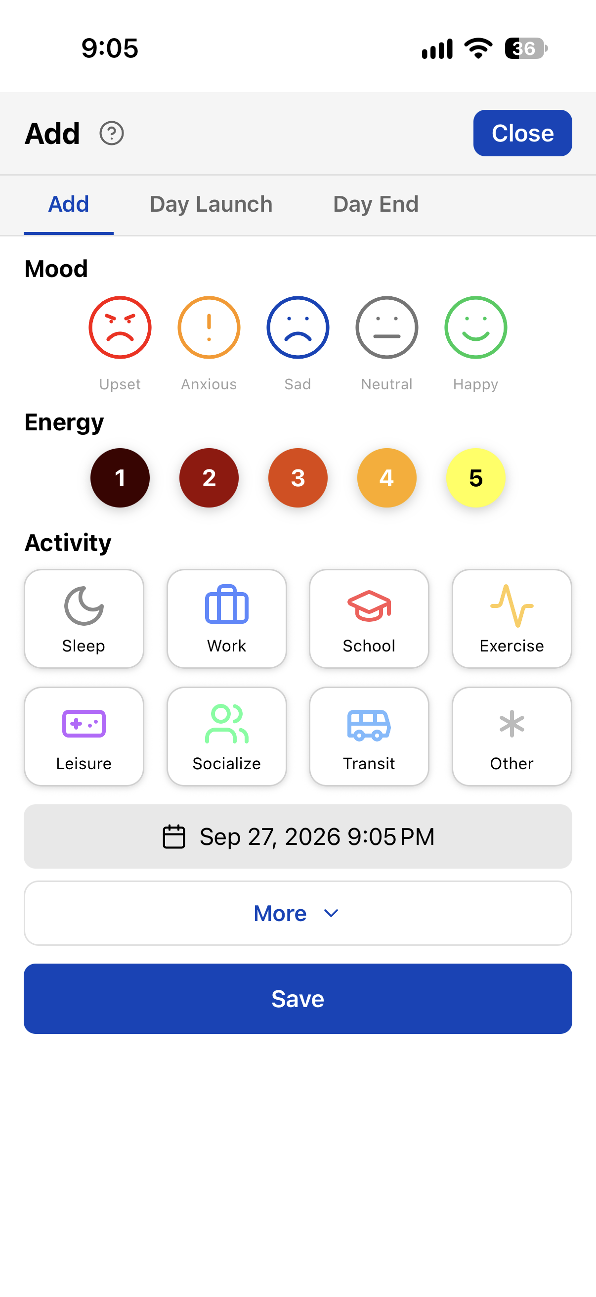
One tap to open, tap a measure, add an optional note, done.
The entry will be timestamped to the current time. We added a date/time picker in case want to change that.
The above dialog takes three taps to register a measure:
Let’s make another input screen that records an event with one tap:
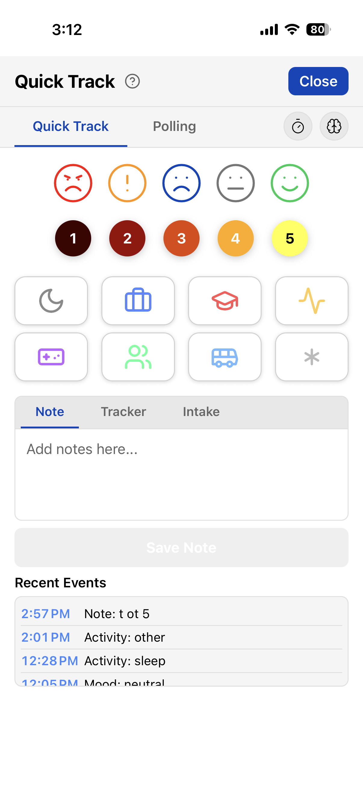
This one doesn't have a Save button. If you leave the above dialog open, you can just tap on a measure to add it. Events show in the Recent Events list.
We can avoid even a single tap by using Siri Shortcuts. Open App Menu→Settings→Siri Shortcuts and tap Add to Siri next to each phrase you want:
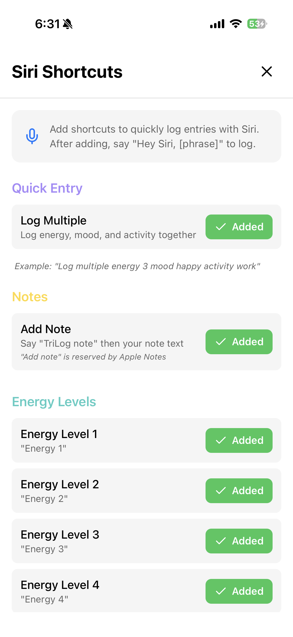
So now you can say "Siri, energy 3" or "Siri, mood sad" or "Siri, activity sleep".
02Putting it all together
OK, we have the main display and a couple of input screens. Let’s connect them.
A bottom bar moves between the screens. Try it below — the bar is tappable, and Close brings you back:
// TAP + · ● · ||| IN THE BAR AT THE BOTTOM
Four buttons:
There’s week navigation up top.
These screens are from the actual app and have a few features we will cover later, like the daylight and current time indicator on the left side of the main chart screen.
03Notes
So now we have an app to quickly input energy, mood and activity, with a time stamp.
We can also add a note to the entry.
We can do a lot with notes.
03.1What is a note
A short detour, to explain the tagline at the top of this page. Programmers keep something called a log: a running record of what a program does — one line at a time, each line stamped with the exact time it happened.
Writing a line to the log takes one line of code, called console.log:
THE CODE
console.log("payment failed — retrying")
THE LOG IT WRITES
Nobody tries to remember what a program did last Tuesday. When something breaks, you read the log.
TriLog notes work the same way, for your day. Anything the app doesn’t already track, you write as a note — one line, timestamped, on the record:
YOUR DAY, AS A LOG
When a week goes wrong — or goes unusually well — you don’t have to remember. You read the log. That’s the “log” in TriLog.
People don’t usually read raw server logs. There are too many lines. They use log analytics tools that summarize, filter, sort, and search. TriLog does the same for your day: the lines are the record; the views, summaries, and analysis are how you read them back.
03.2Enhancing notes
Let’s add a couple of features to notes to make them easier to enter and review.
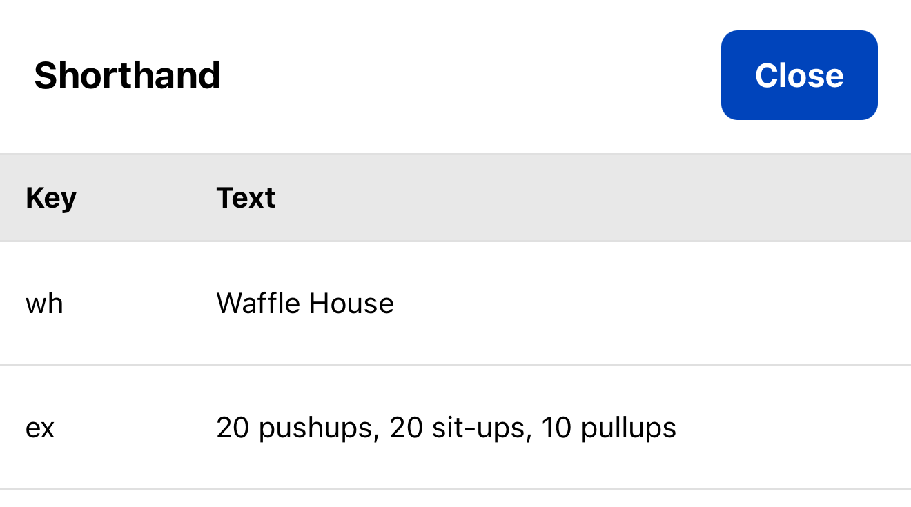
First let's add a shorthand dictionary for words we use a lot.
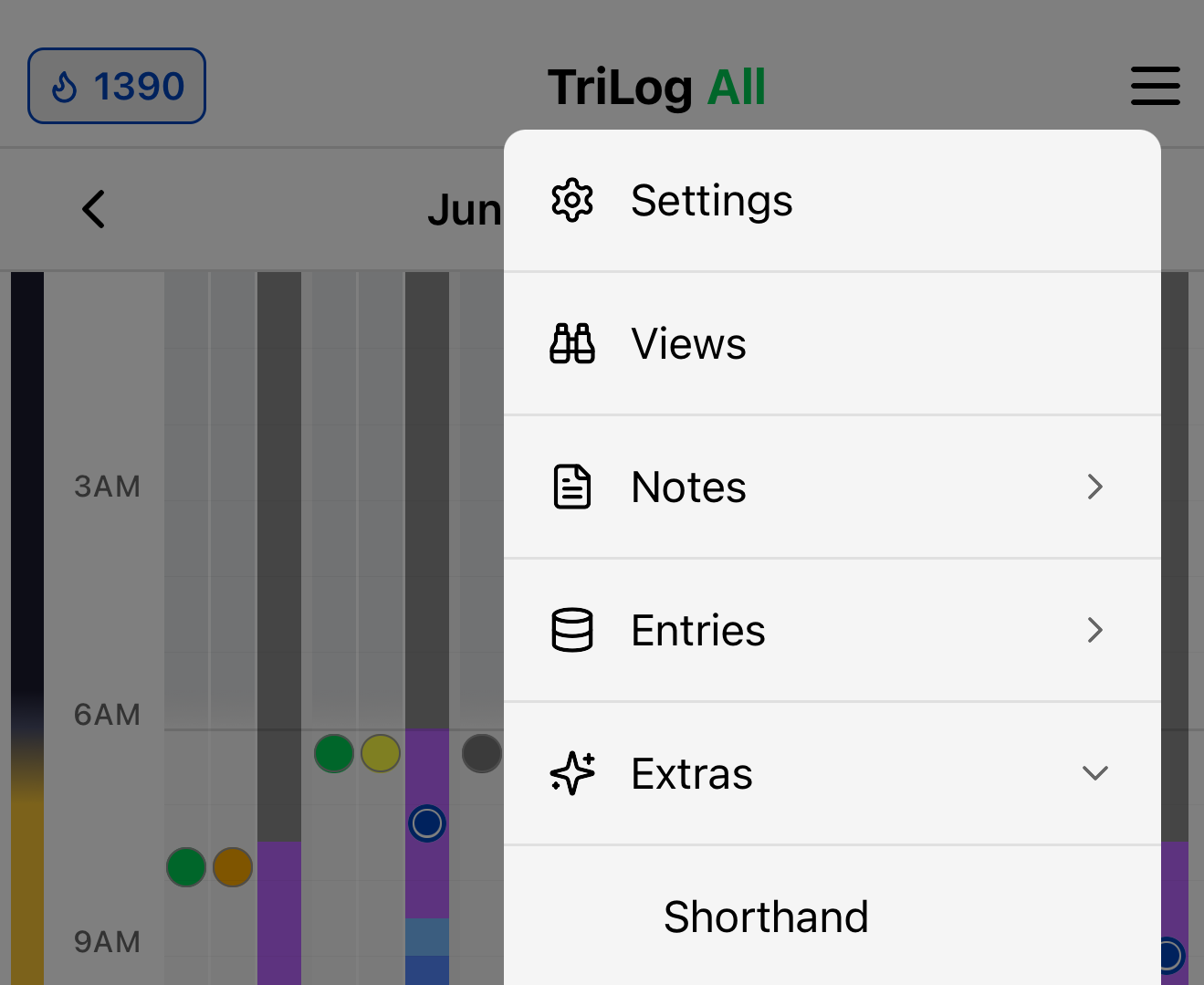
Now let’s add some simple note types. Instead of adding another button or dropdown to the UI, we'll use a prefix letter. To mark a note as a type, you start it with a particular letter:
Prefixes are optional — a plain line is already a note. Start with one of these to give it a type.
slept badly, neck stiff
No prefix — a plain note. Timestamped and on the chart like everything else.
m coffee c100 p2
Meal note. Calories: c100, 100 cal, or just 100. Protein: p20 or p20g. Carbs: cb5 or cb5g.
h took vitamins
Health-related note.
cy m · cy -m · cy green
Cycle note — for menstrual cycles or any multi-day event.
cy m marks the start of a period (red), cy -m marks the end (light blue).
cy green — or any color — starts a colored span of days.
j felt good today
Journal entry. Collected into the daily journal.
03.3Viewing notes
Let’s display notes on the main chart screen. On the interactive image below, tap on the notes icon to enable notes on the chart.
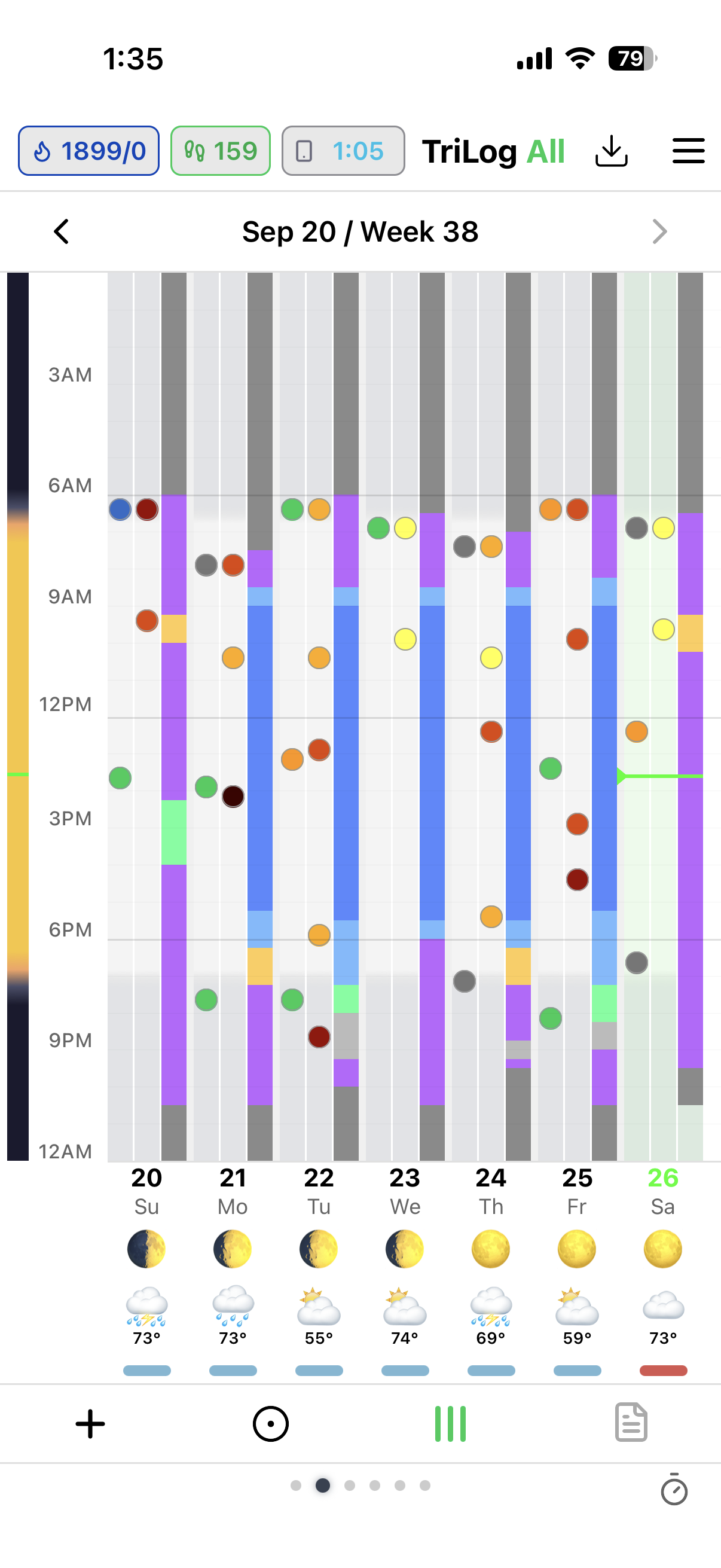
// TAP THE NOTES ICON, RIGHT END OF THE BAR
If you long press the notes icon, you can filter the notes by type.
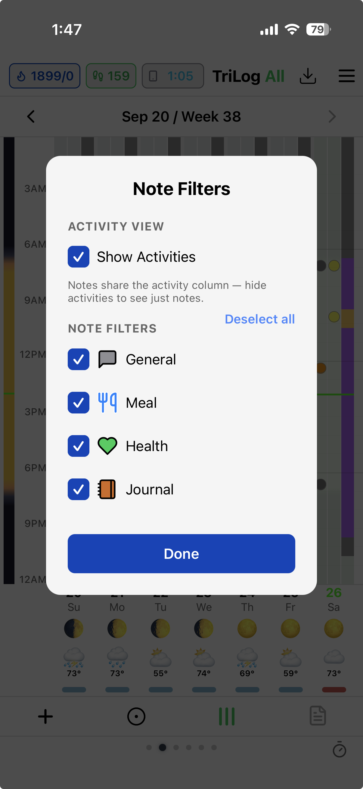
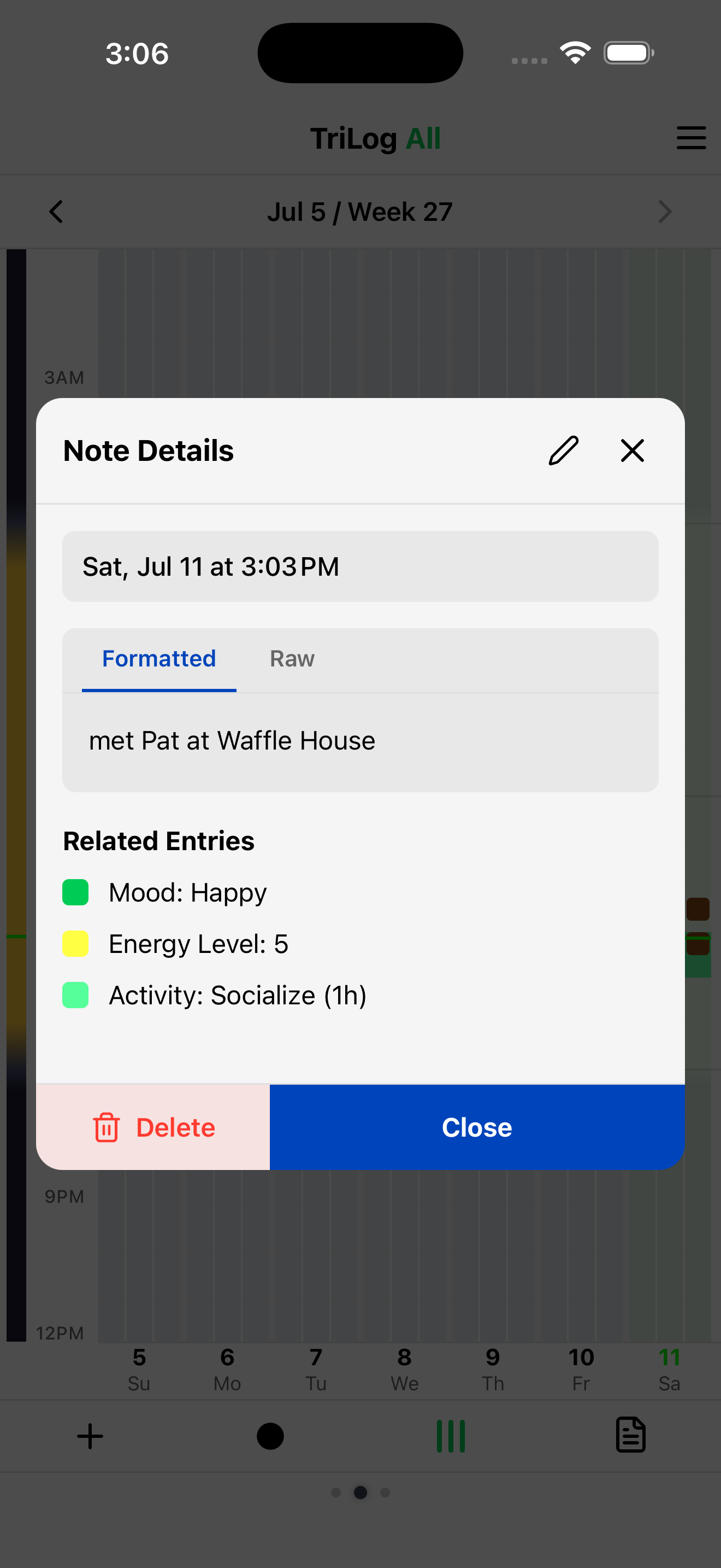
Tap on a note to view/edit it:
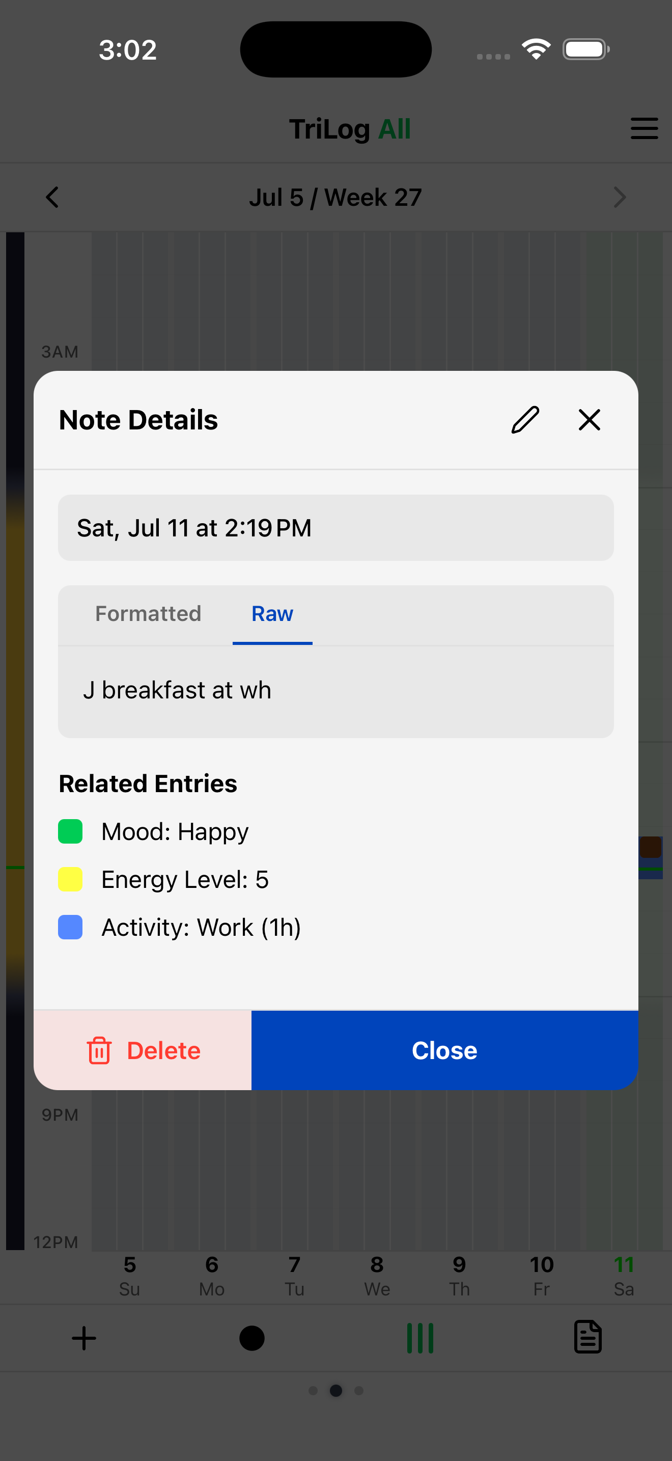
This next figure shows the original note text - we used a shorthand entry here and a j/journal prefix to mark it as a journal entry.
In addition, you can see all of your notes in App Menu→Notes, or in the Notes view explained below.
03.4Note Types
Meal, journal and cycle notes get special treatment in the app.
In settings you can turn on the calorie/macros display and configure it to either show totals from your notes or from Apple Health.
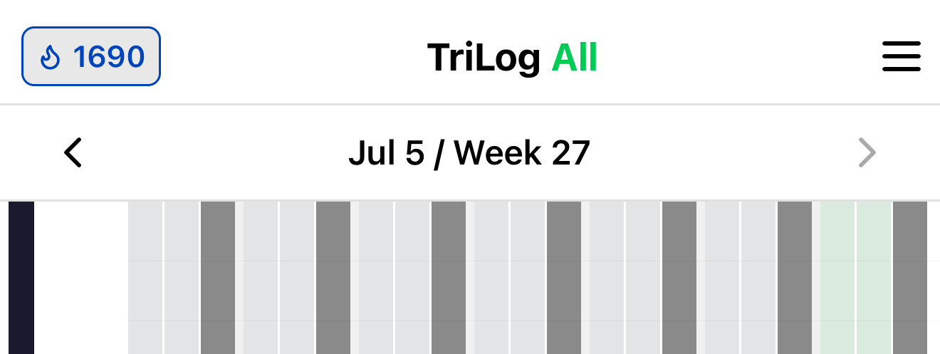
Journal notes are collected into a daily journal. You can view the journal in App Menu→Notes→Journal. The screenshot below shows journal notes combined into single day entries, along with items from Day End (which we'll cover later).
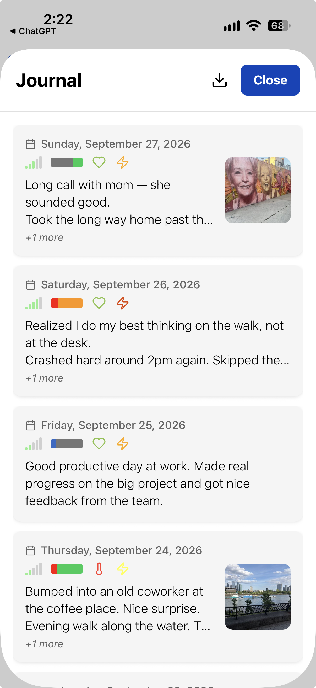
The journal can also pick up entries from trackers you choose — a movie rating, say, shows up as Movie: Inception ★★★★☆ — loved it between your reflections. More on that in Trackers.
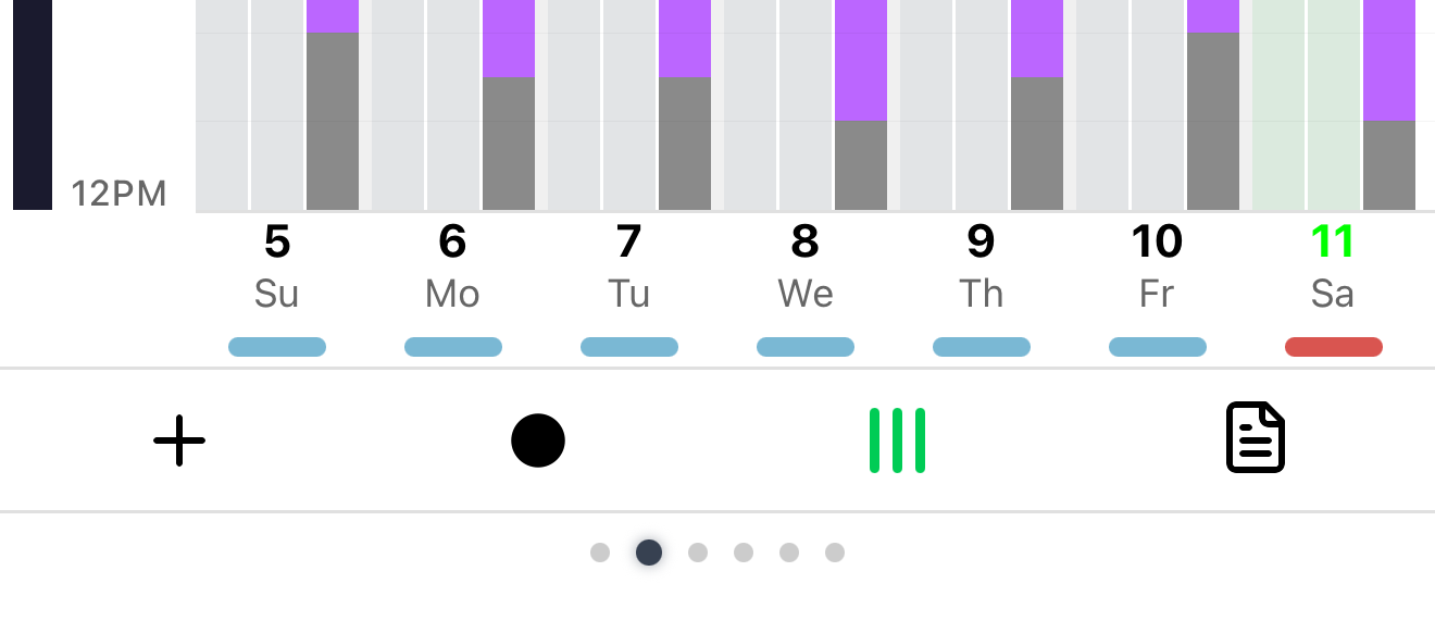
Cycle notes track a menstrual cycle — or any recurring multi-day span. Turn them on with Show Cycles in Settings→Appearance, and set your Cycle Length there too (default 28 days). They show on the main chart as a colored band on the day columns.
More on cycle notes
cy m marks the start of a period, painting those days red. cy -m marks the end — from there a blue band runs forward to your predicted next start (the red start plus your cycle length) and shrinks day by day, so the blue tail is a countdown to your next period. The predicted start day shows a hollow red marker until you log the next cy m, which snaps the prediction to what actually happened. cy green — or any color — marks a colored span for any other multi-day event.
04Trackers
We have five built-in note types now: plain, meal, health, cycle, journal.
One more lets you define your own: a tracker. The prefix is t, then a short
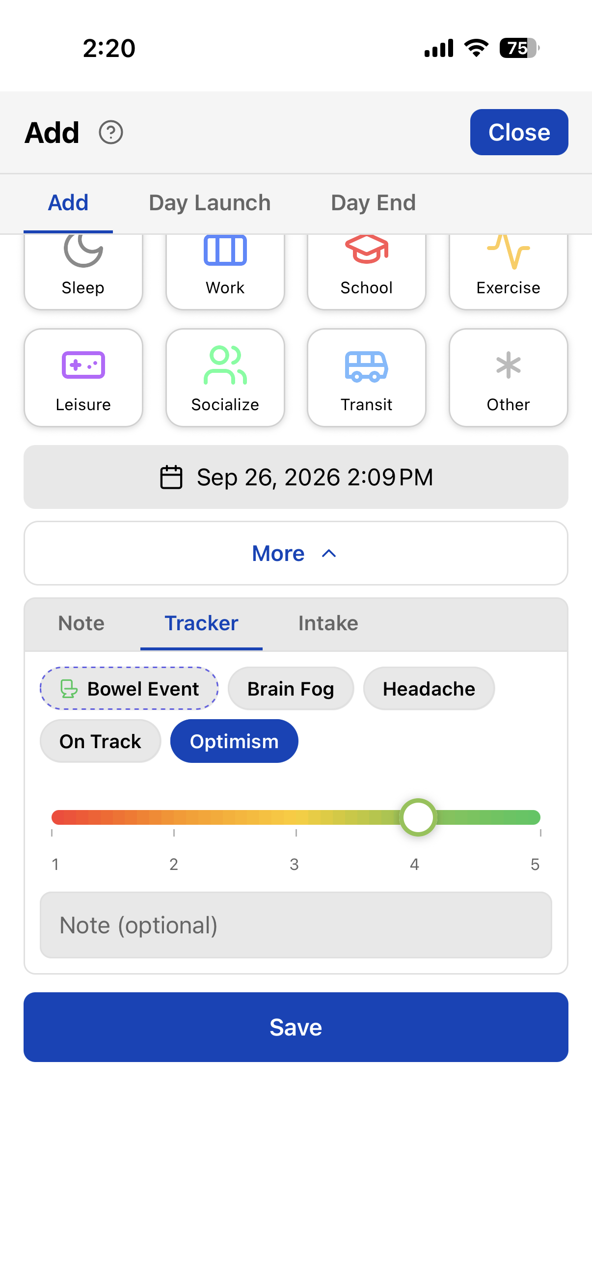
key, then a value — t opt 4 for Optimism at 4.
You can type that, or skip remembering keys: TriLog also puts a button for each tracker in the Trackers tab, with the input you chose for it. Optimism as a slider:
→ MORE ON TRACKERS — DEFINING, TYPES & SEEING THEM
05Intake
Some of what you log isn’t a rating or simple value. It’s something you took: a coffee, 200 mg of magnesium, a glass of wine, a dose of medication.
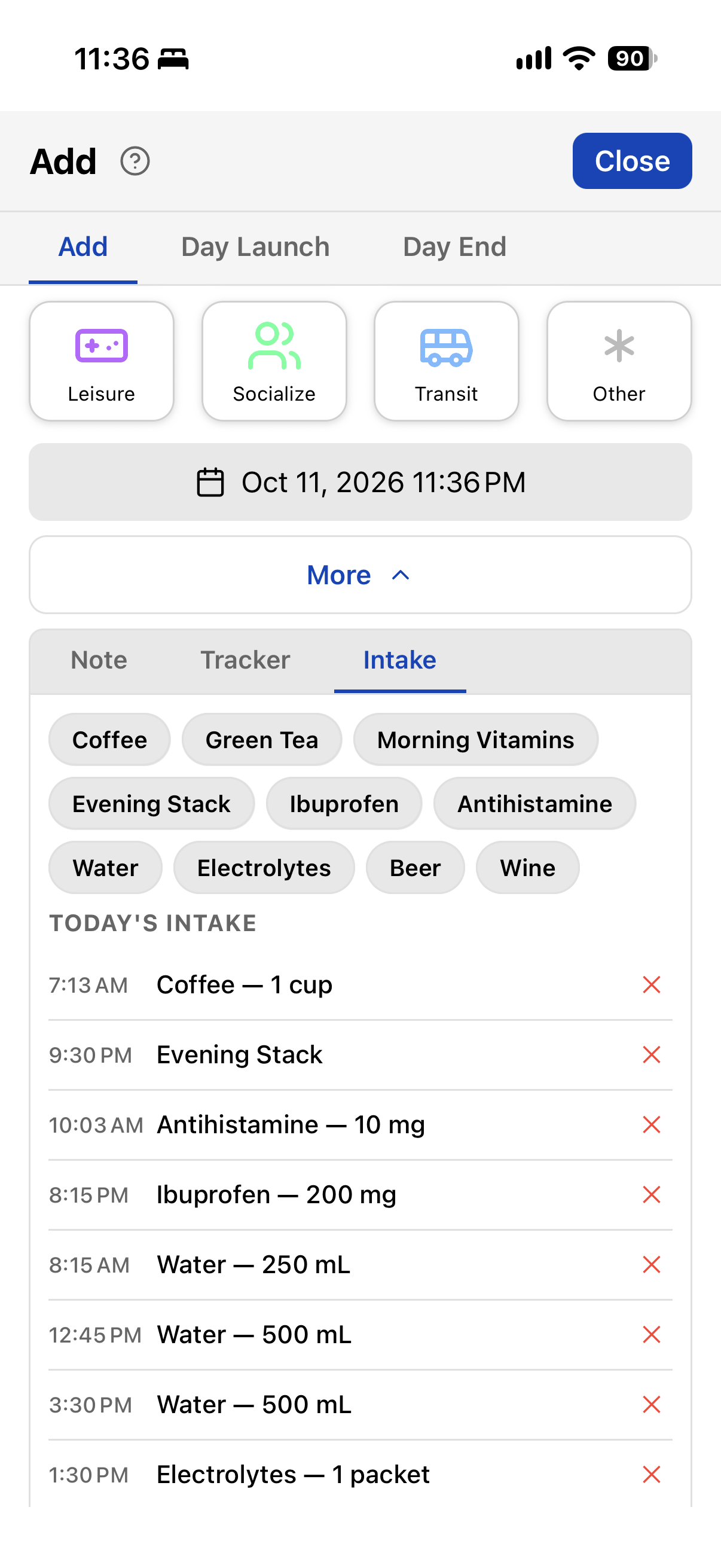
Intake is a library of named items — amount, unit, category — each one a button in the
Add dialog. Pick Coffee, tap Add; or type int coffee. Same log either way:
→ MORE ON INTAKE — LIBRARY, CAFFEINE & CHARTING
06Forms
Trackers take one value. Intake takes a name, amount, and unit. Some events need more than that — a pain episode with location and intensity, a bowel event with several fields, a restaurant review.
A form is a set of fields you fill in on one screen and save as a single entry. Under the hood it’s a bundle of trackers; in the Add dialog it shows up as a dashed chip on the Trackers tab. Tap it, fill the fields, done:
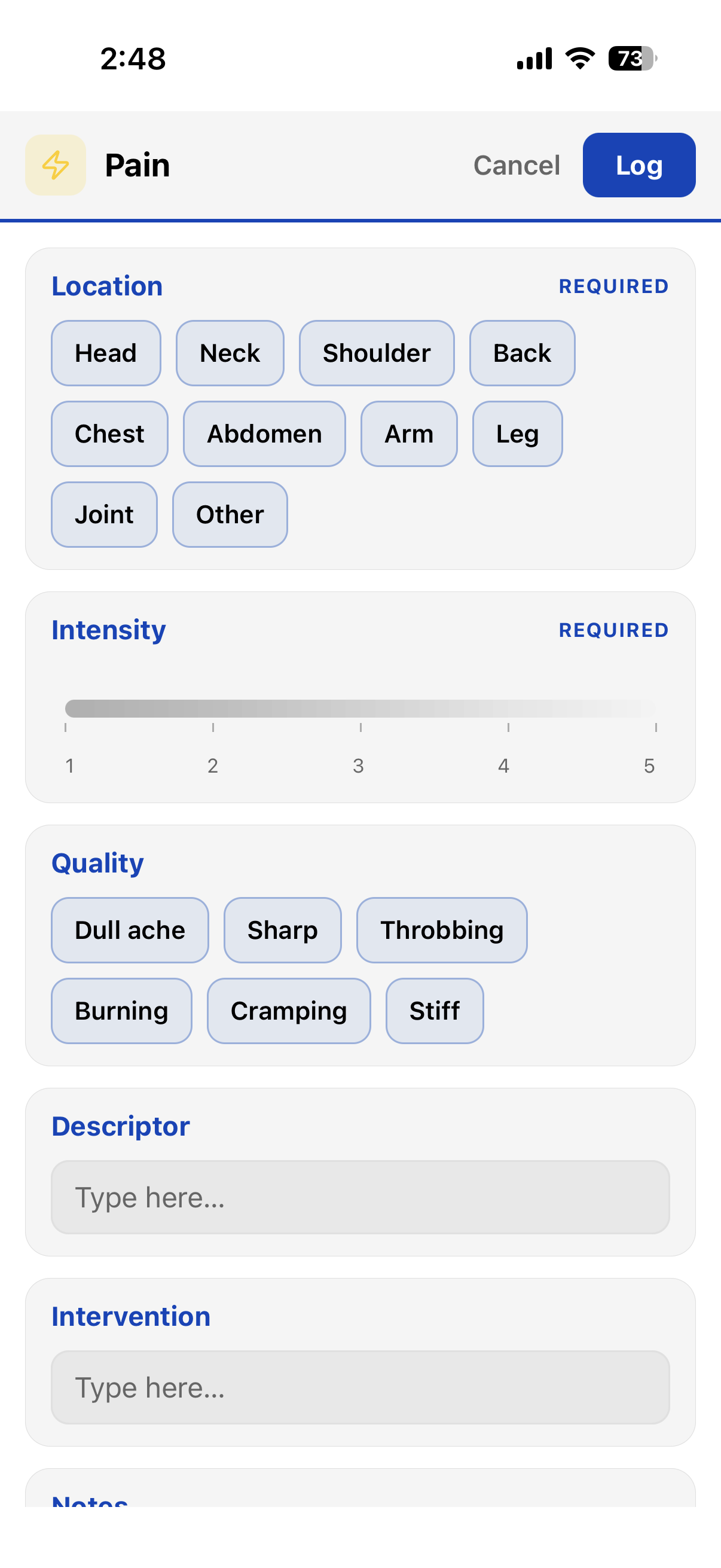
→ MORE ON FORMS — BUILDING, TEMPLATES & LOGGING
07Notes View
Now that we have notes, trackers, intake, and forms — all of them lines in the same log — let’s give them a view of their own. Swipe left from the main chart to the Notes view. Every input for the week shows up here: plain notes, meals, health, journal, cycles, tracker entries, intake, and forms.
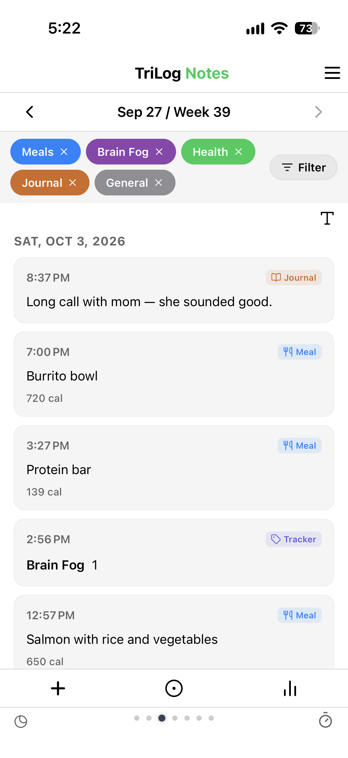
Click on the Chart icon in the bottom bar to switch to the Notes Chart View.
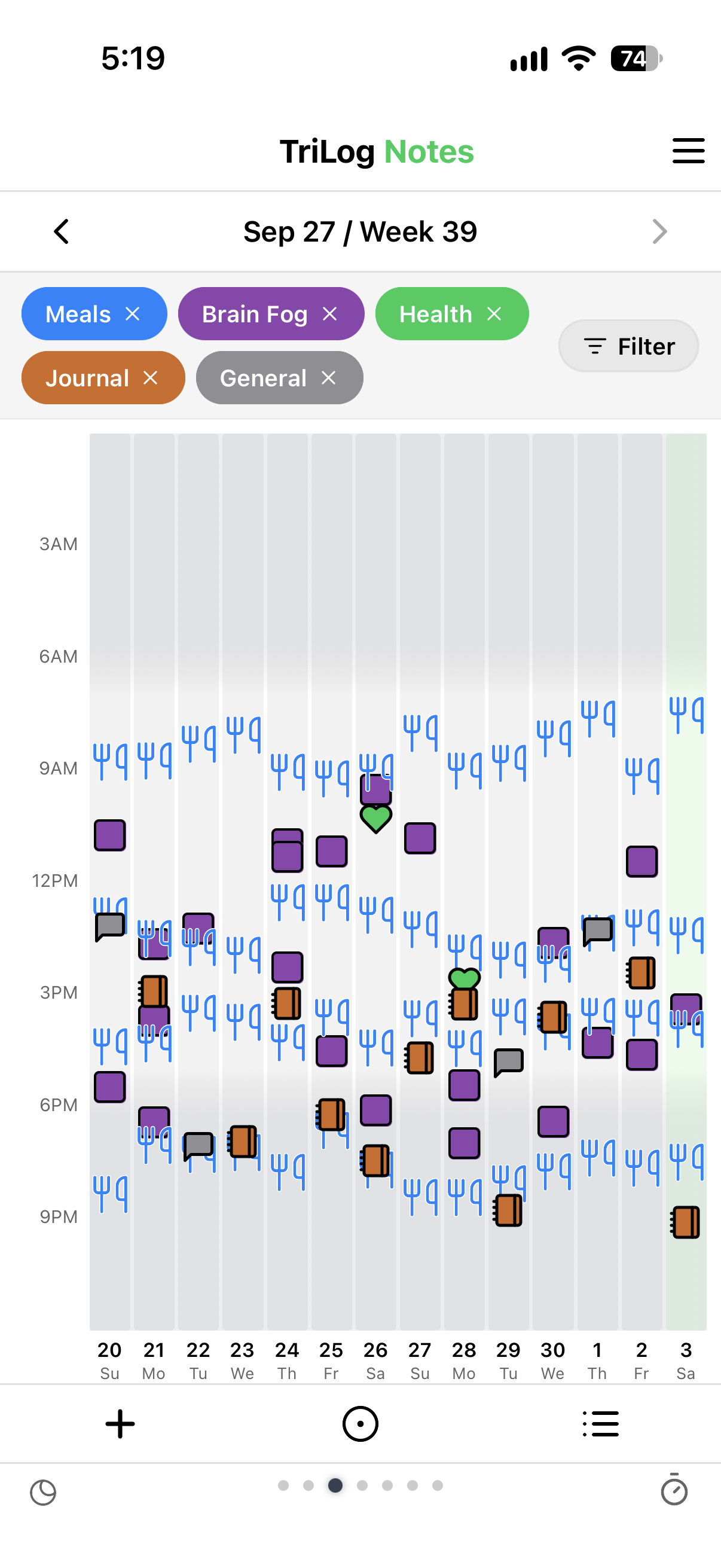
The chart is also an input. Long-press an empty spot to add something at that time. Press and drag a marker up or down to fix its time, for when you logged it an hour late.
Note the filter chips at the top of the chart. They work the same as the filter chips in the Notes List View.
08Habits
There’s one more thing we need to track: Habits. A Habit is a predetermined behavior that we want to perform, like a repeating goal. This could be done with a day tracker, but a habit is a different kind of thing — not a measurement of how the day went, but something you decided to do — so it gets to be a first-class item with its own screen. Add Habits in App Menu→Extras→Habits, and toggle on/off.
Habits get a dedicated view: one row per habit, one column per day, a check for each day you did it. No streaks, no scores. Swipe left/right to switch between views, or App Menu→Views→Habits.
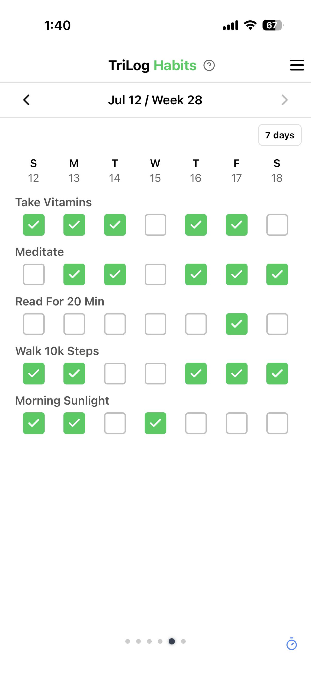
Tap a habit’s label to see a multi-month view.
09Trials
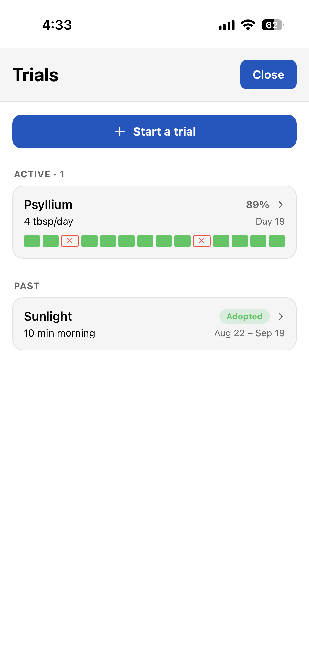
A habit is something you’ve already decided to keep doing. A lot of the time, you haven’t decided yet — should the magnesium stay, does cutting afternoon coffee change your evenings? Try it for a while and see.
A trial is that experiment: a name, optional details and hypothesis, a start day, and eventually a verdict — Adopted, Dropped, or Inconclusive. Start one in App Menu→Extras→Trials:
→ MORE ON TRIALS — ADHERENCE, METRICS & THE tl PREFIX
10Day End
Almost everything so far is an event — an item with a timestamp.
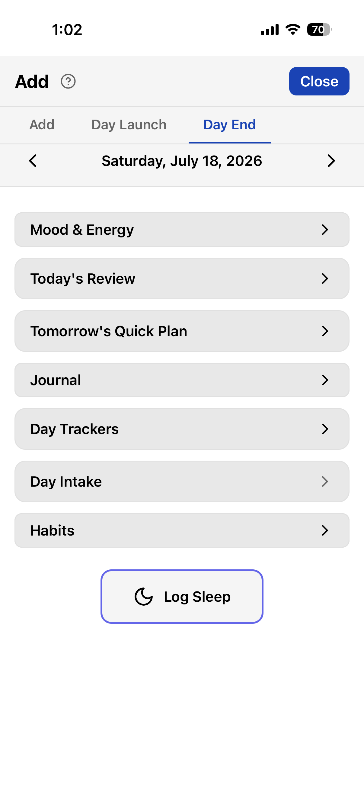
We need a separate set of items that attach to the whole day. And a good moment to fill them in: the end of it.
Here's the first section, Mood & Energy.
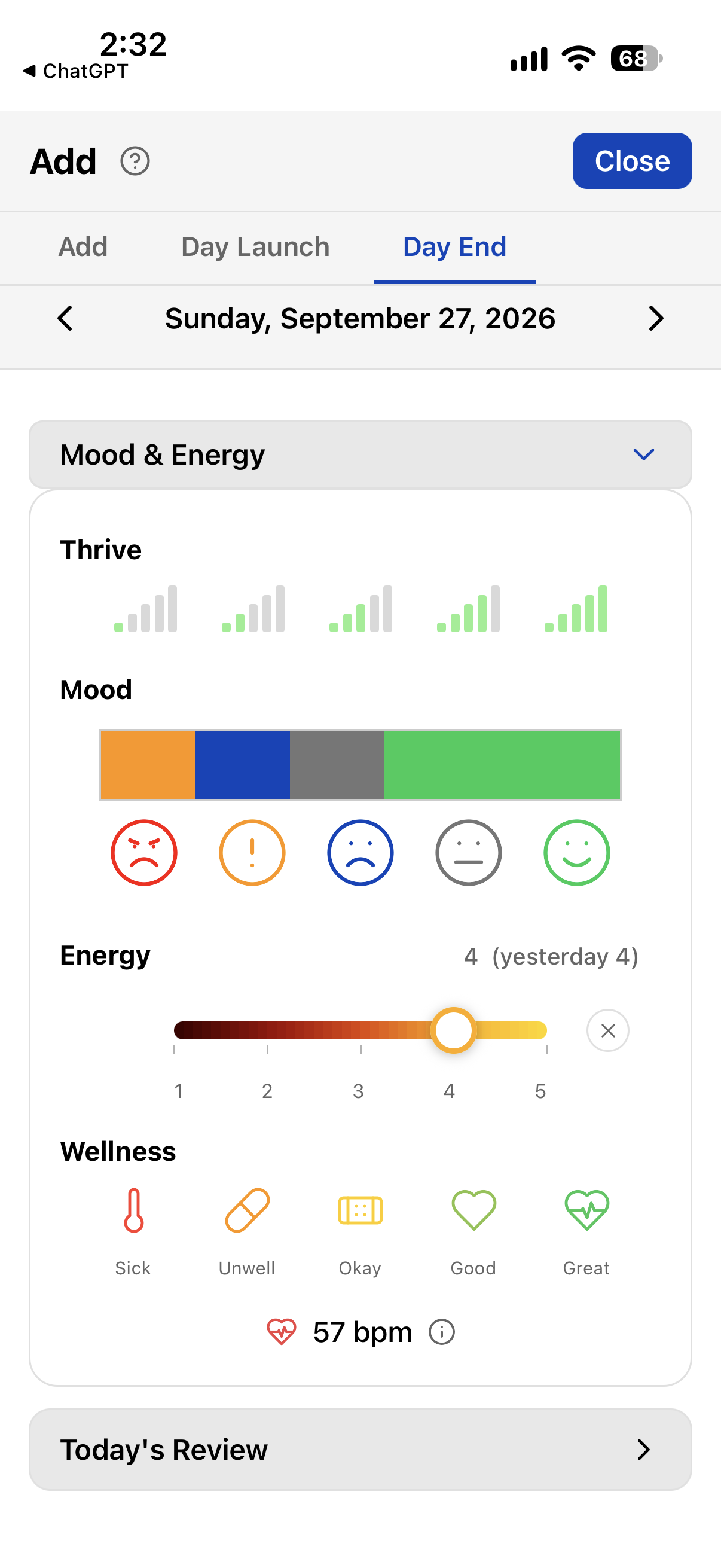
This has a couple of extras compared to the regular entries.
Thrive. How successful the day was, however you define that.
Mood. Click on the icons to add/subtract mood lengths.
Energy. The Day End energy slider takes decimals and shows yesterday's value for reference. We limit regular entries to whole numbers for fast input, but at the end of the day you have a bit more time to reflect and give it a more precise value.
Wellness. If you were unwell today, better to note this in Day End, separate from regular entries that can track specific symptoms. If you're under the weather, a symptoms note goes with it.
The rest of Day End, in order:
Today’s Review & Tomorrow’s Quick Plan. Check off the (up to) three goals you set last night, then set three for tomorrow. Plan first, review after — you can’t add a goal to today after the fact.
Journal. The day’s reflection, with the j notes you wrote earlier listed
underneath, and a photo if you want one.
Day Trackers. One value per day for each day tracker — a rating, a traffic light, a checkbox.
Routines. Some things happen every day at about the same time: the morning supplements, the evening magnesium. Mark a tracker or an intake item Add to Routines with a usual time, and it shows up here as a one-tap item. Tap to log it at its usual time; long-press to pick another. Nothing logs by itself — a record you didn’t make isn’t a record.
Trials. Each running trial, with Did it / Missed for the day. Leave it alone and the day counts as kept.
Intake & Habits. Review the day’s intake and check off habits.
Log Sleep. One tap to mark the start of sleep, which anchors the chart for the night.
11Day Launch
We’ve got Day End. Let’s add Day Launch.
First, sleep ratings.
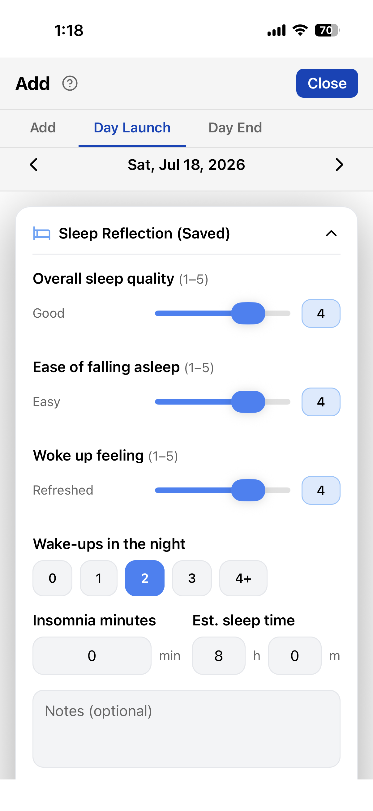
A few more useful things:
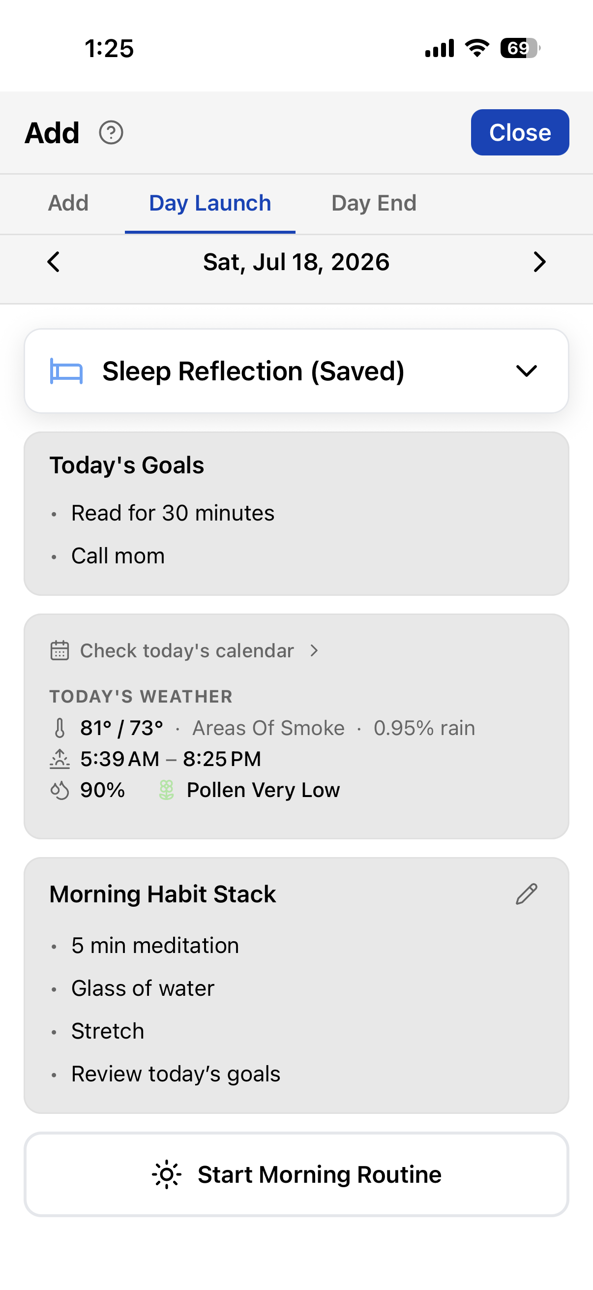
More on Start Morning Routine
Morning Routine is an optional activity that only exists here — you won’t find it in the Add dialog or Quick Track. It’s for one small job: marking when you actually got up, and how long it took to get going before the day proper starts.
The idea is you wake up, open Day Launch, and tap Start Morning Routine. That logs a block on the chart (and can start morning music, if you’ve set it). Then you do your stack, then work or whatever comes next. If you skip the button when you get up, leave it — there’s nothing to backfill later. It only means something if you pressed it in the moment.
12Context
So far, every dot on the chart came from you.
But a day has conditions you didn’t choose — the weather, the daylight, how you slept. We already snuck one in: the daylight shading on the week chart. Nobody logged that; the sky did.
Your phone already knows a lot of these. Let’s pull them in.
The rule for what gets pulled in automatically:
Everything else: money, news, the in-laws? Not automatic. If you suspect it matters,
give it a tracker: t money 2. That’s the division of labor — the phone logs
what it can measure, and you log what only you can observe.
From outside
From Apple Health
Read-only, and it stays on your phone.
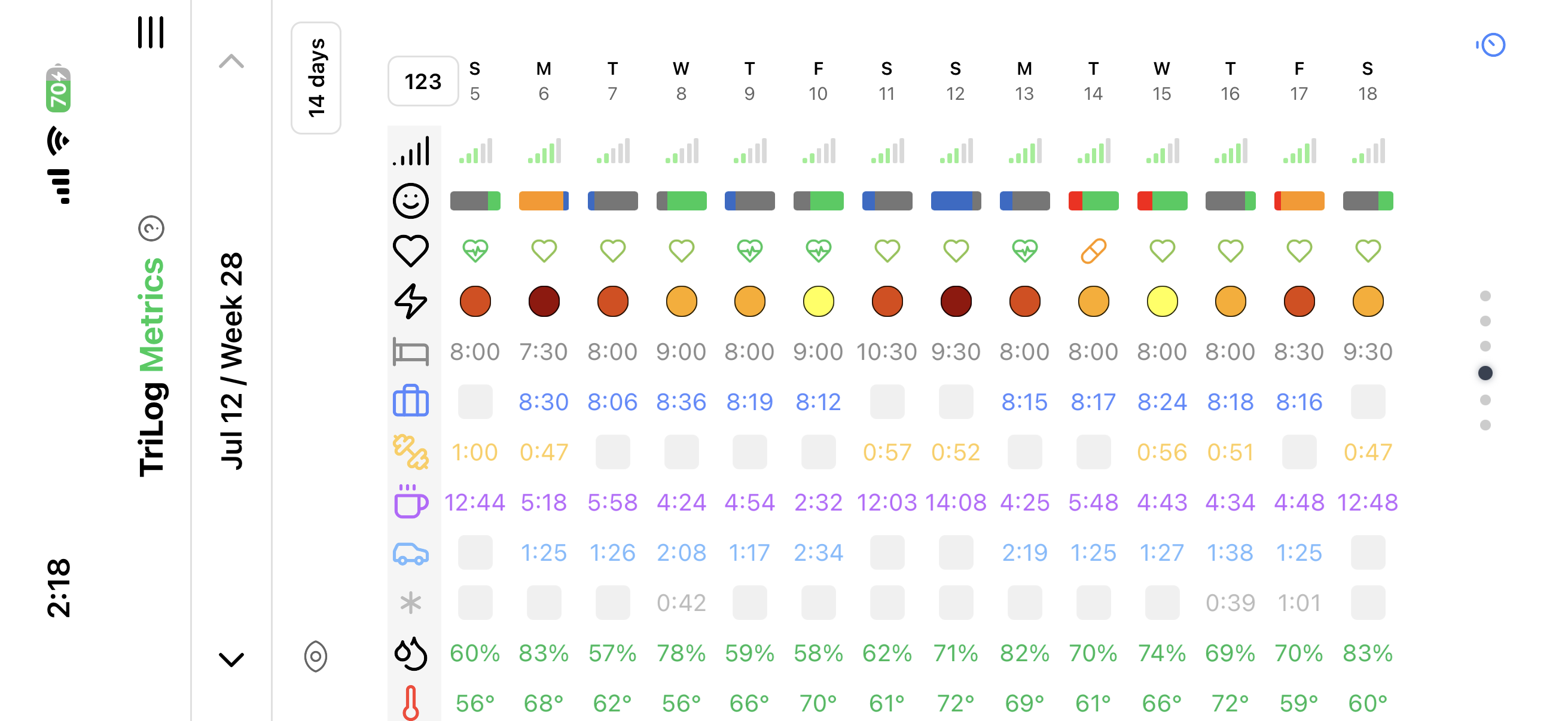
It all lands in the Metrics grid view along with Day metrics — each row a measure, each column a day:
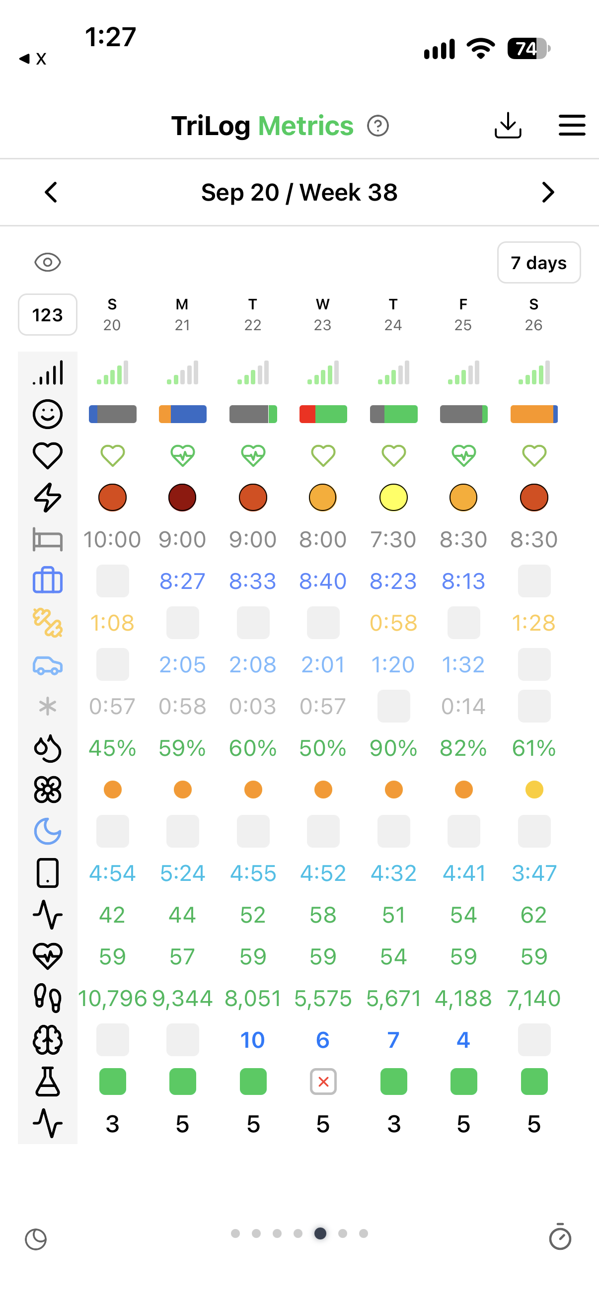
The grid takes your own rows, too. From the eye icon, turn on a day tracker or a trial, and it sits right next to the weather and your sleep — the trial rows we saw in Trials live here.
Toggle to 14 days and it turns landscape:
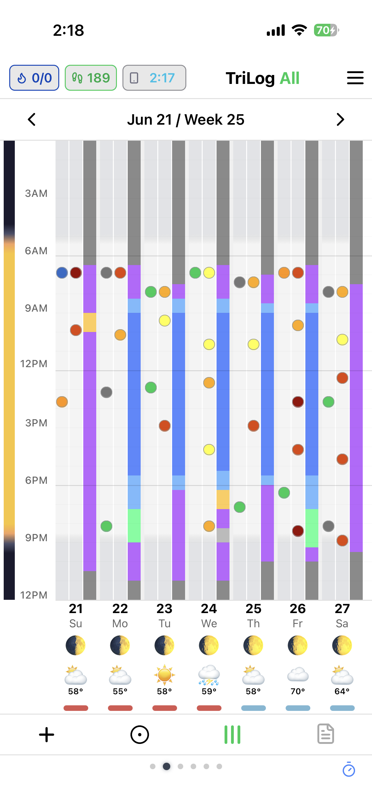
And you can optionally put some context on the main chart itself (toggle on/off in settings) — moon phases, weather, cycles:
13Screen Time
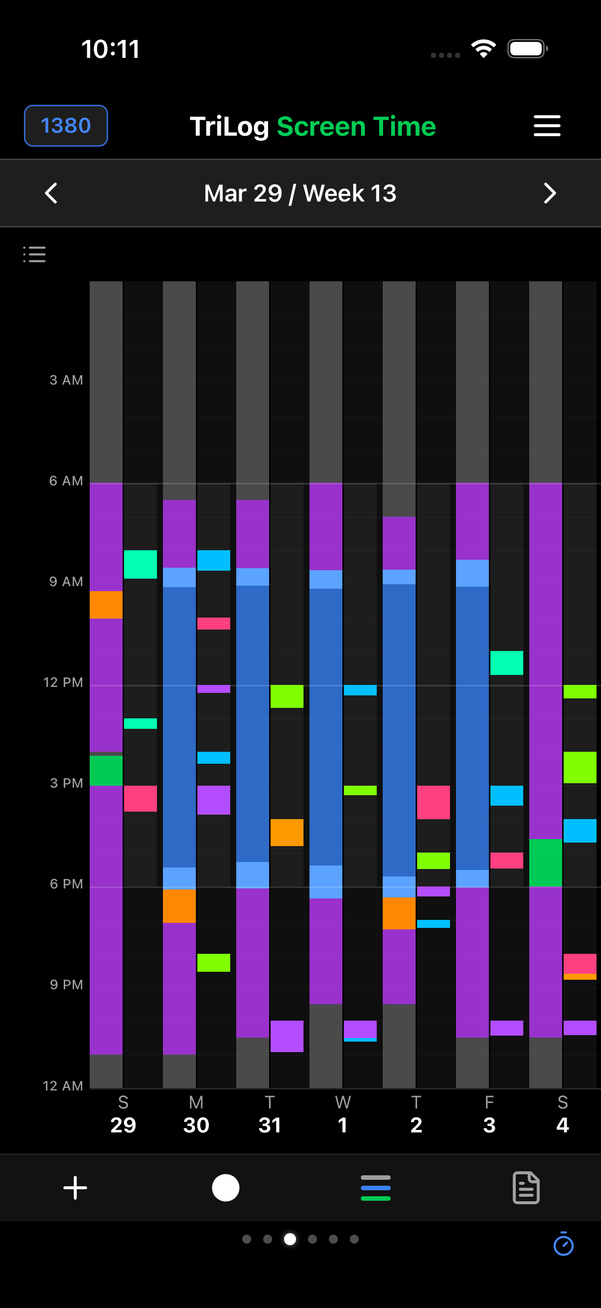
One more special type of context: screen time. Valuable enough to have its own view.
Screen time is also a special metric because of its strict privacy guarding — Apple doesn’t let apps pull this data, only display it. But we can superimpose your data over the display Apple provides: your mood, energy, and activity timelines on the same chart as screen usage. The bars icon at the bottom switches metrics.
14Analysis
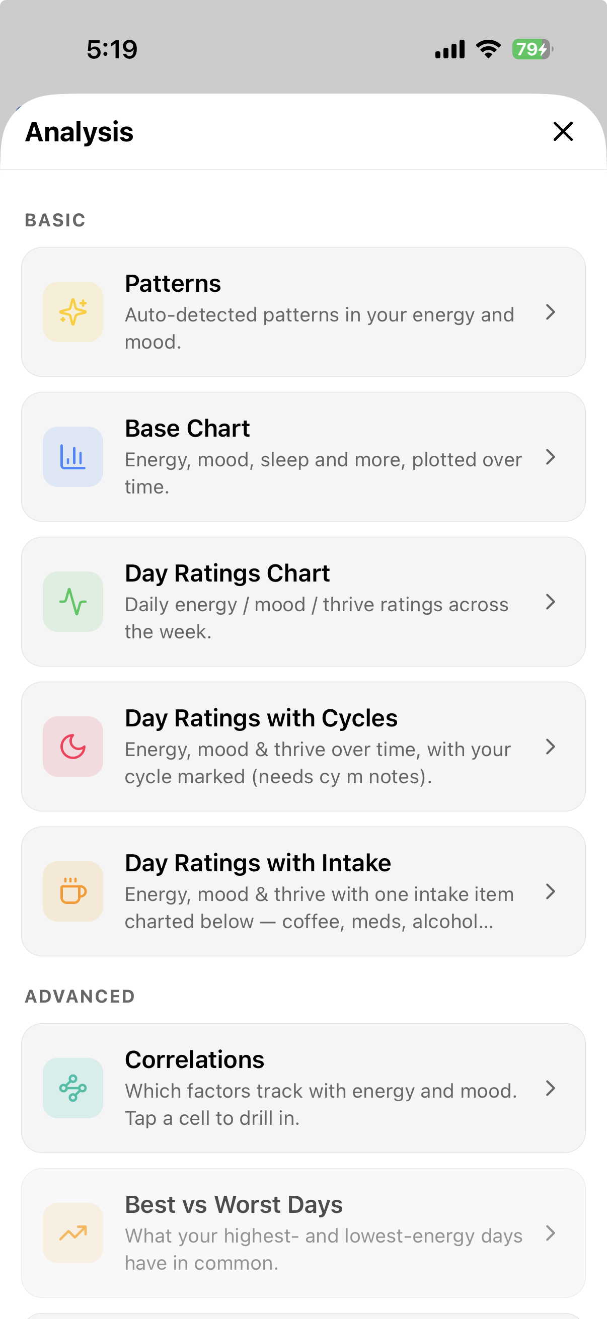
OK — we’ve got a pretty rich log of events. We can view things in lists, and some items have special views, like journal notes. We have a grid of our metrics and context to compare against. But we want to be able to analyze and view our data from any perspective. Let’s build a complete set of tools to process our logs.
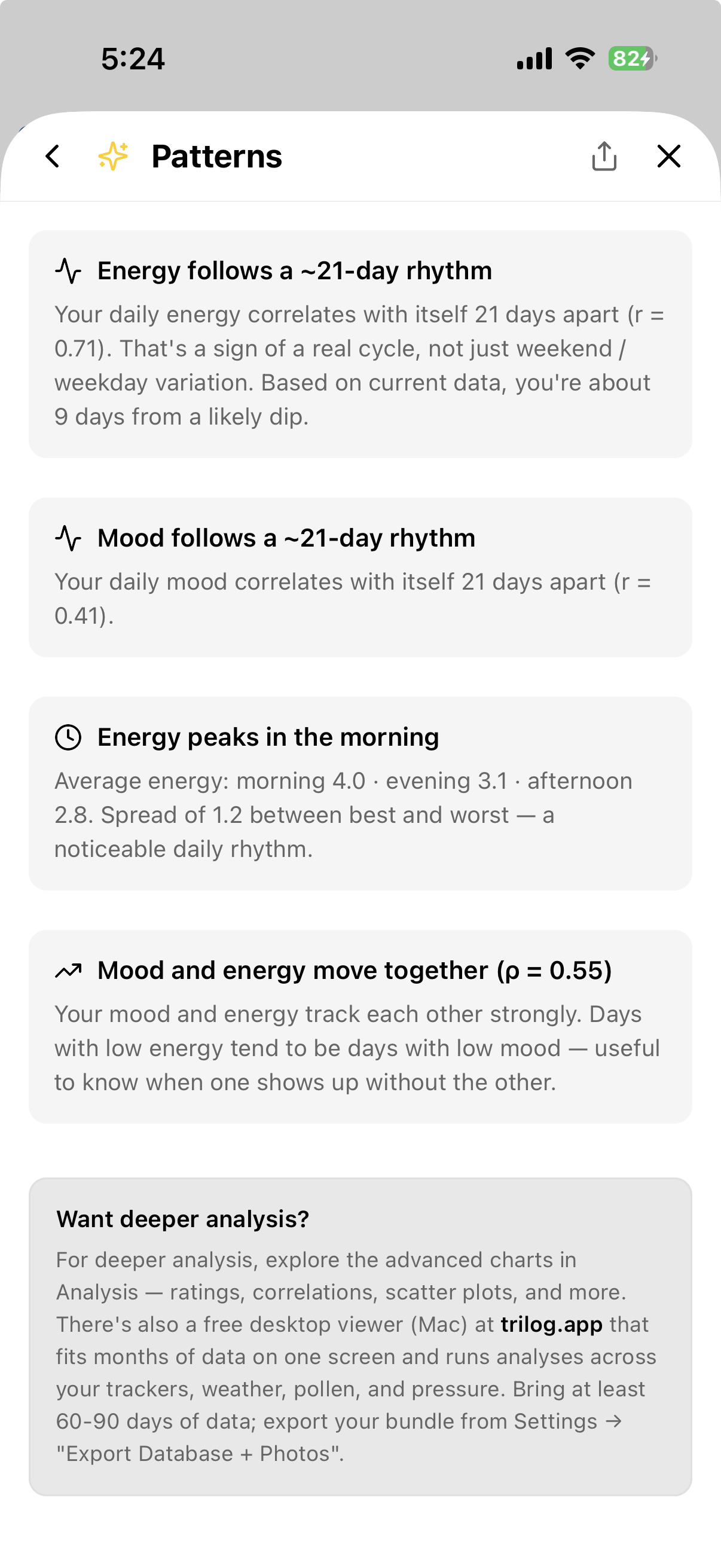
Patterns looks for them automatically:
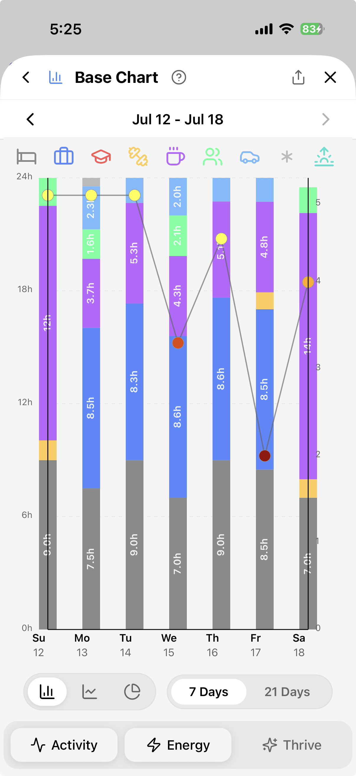
The Base Chart plots the raw measures over time:
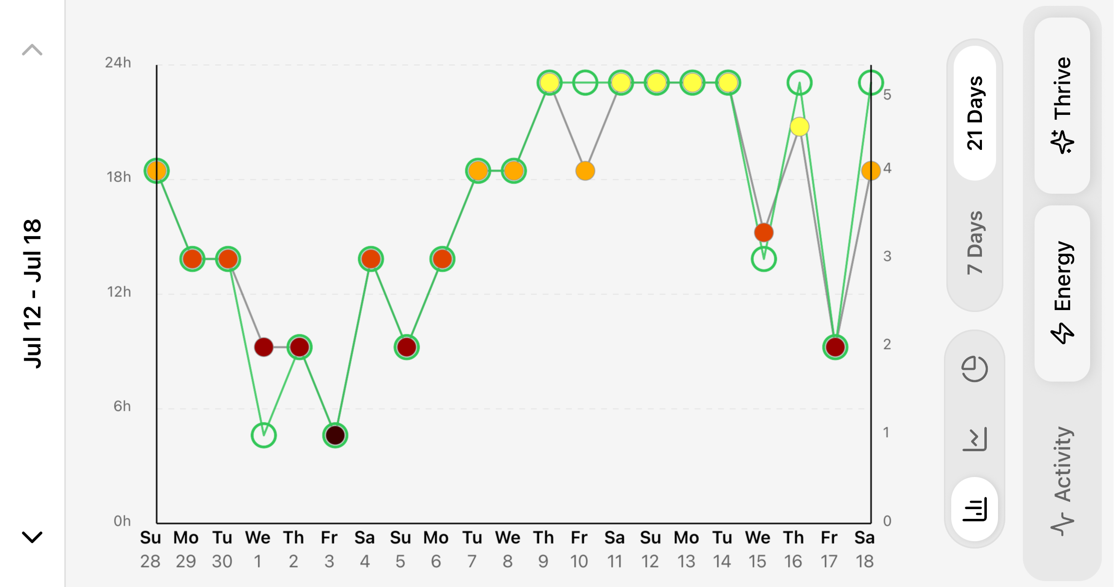
Day Ratings — the Day End verdicts, charted:
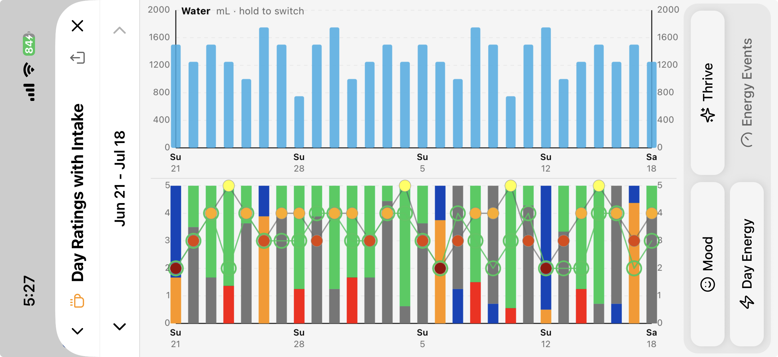
The same chart with an intake item above — one item, or your total caffeine in milligrams. Long-press to switch:
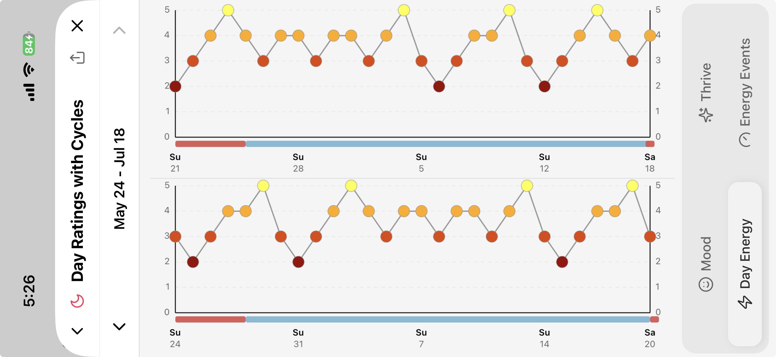
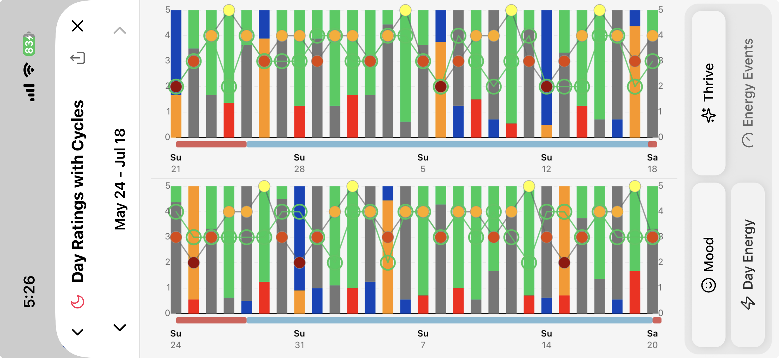
Or with your cycle marked, against energy and against mood:
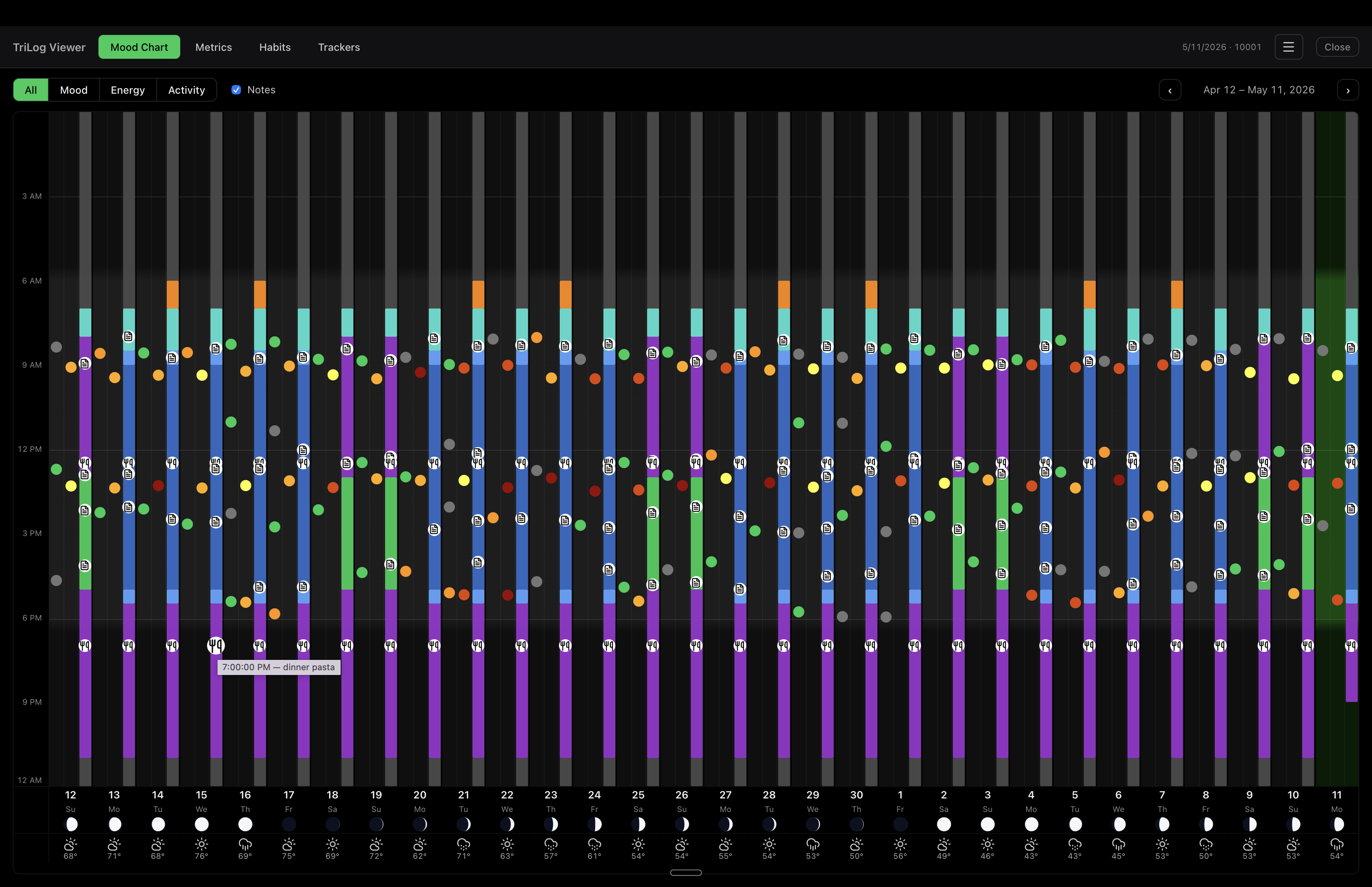
Interactive dashboards. A phone screen is good for viewing 1 - 3 weeks. A desktop display is better for months of data. Two views can export themselves as a single self-contained web page — no account, no upload, nothing leaves your hands — that opens in any browser. Both samples below run on demo data — click around.
The main chart. Tap the download icon in the header. You get the same chart as the app, laid out several weeks side by side (4 to 12), with light and dark themes. Hover any mark for its details.
The Metrics grid. Tap the download icon in its header and choose Interactive Web Page. Pick a range and see summary numbers, trends as daily values or 7-day averages, Energy charted against any other measure, which factors move with an outcome (same day or next day), weekday averages, and this period against the one before.
→ OPEN THE SAMPLE METRICS DASHBOARD
As everywhere else, it shows how things line up; what that means is up to you. Prefer a spreadsheet? The same menu offers an Excel file with the data and charts ready to go.
Provider Report. Sometimes the person who needs to see your log is someone else — a doctor, a sleep clinic, a therapist — and they have ten minutes, not your app. So TriLog can make a printable summary: App Menu→Tools→Provider Report. Pick a range (one to twelve weeks) and any trackers or forms you want included, and it creates a PDF to share or print.
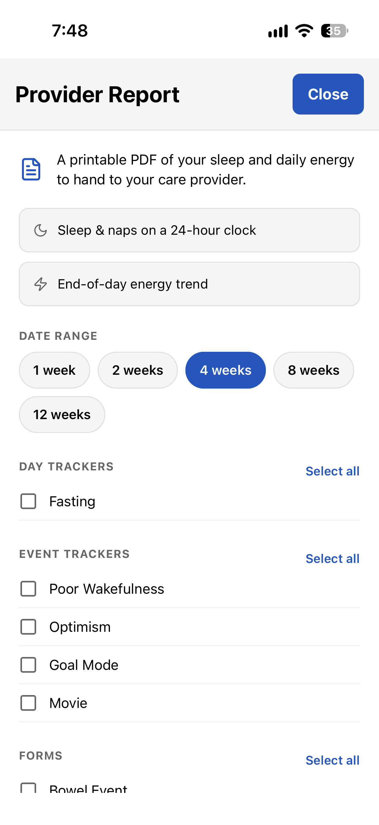
The report shows sleep the way a clinician reads it — a 24-hour chart per day, noon to noon, so a night of sleep is one unbroken bar and naps stand out — with summary numbers (average sleep, days with a nap, longest nap), your end-of-day energy as a line, and the trackers you picked. A form comes through whole: when each entry happened, then a log of every entry with its answers.
→ OPEN A SAMPLE PROVIDER REPORT (PDF)
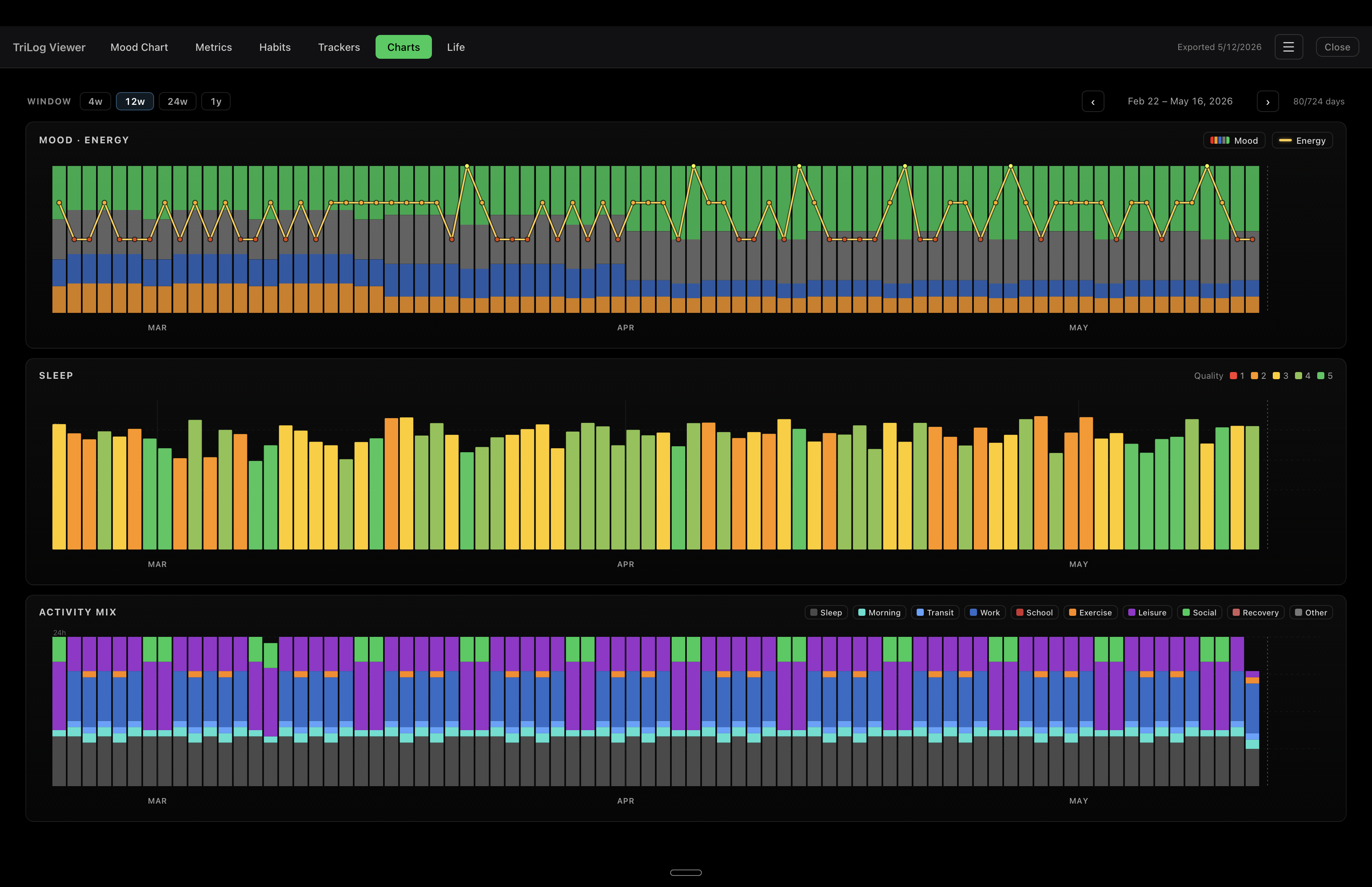
Desktop viewer. One more way to look at your data: a free desktop app that reads your TriLog export. It’s open source, so you can also take it further — download your data, change the app, add the features you want. trilog.app/viewer →
15Extras
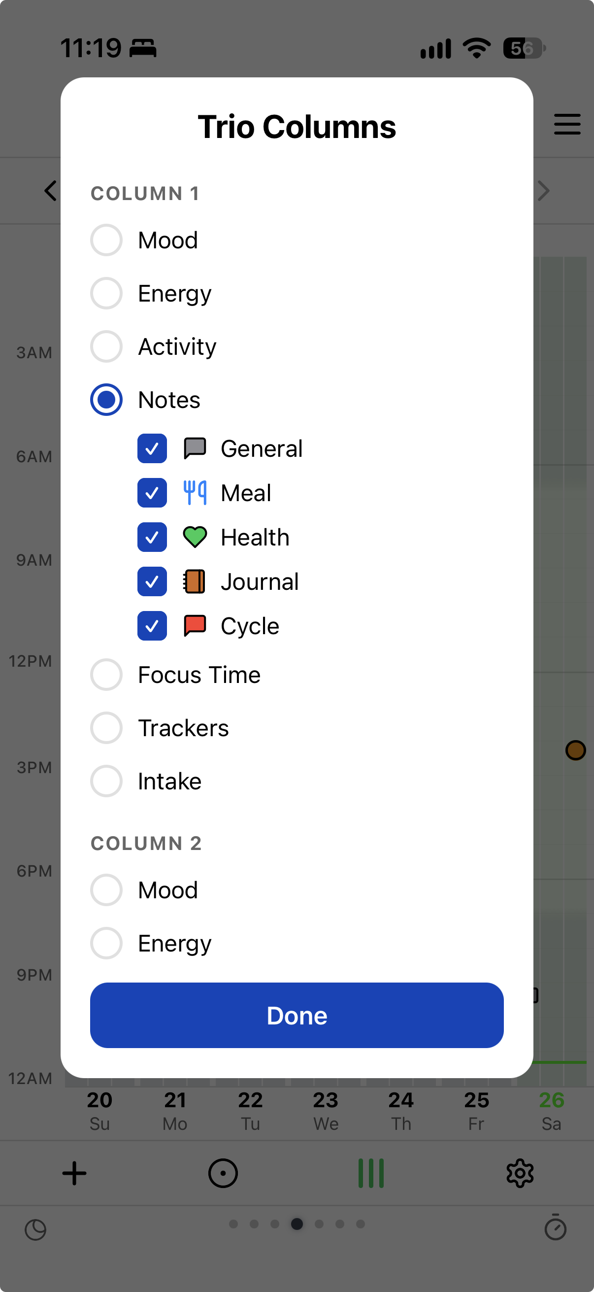
Trio view. The main chart has three fixed columns: mood, energy, activity. Trio is the same week chart with three columns you choose — mood, energy, activity, notes of certain types, focus time, trackers, or an intake category like caffeine. The Notes view chart now covers most of this ground, but Trio is still handy for putting a few chosen items on one screen, in the main chart’s format.
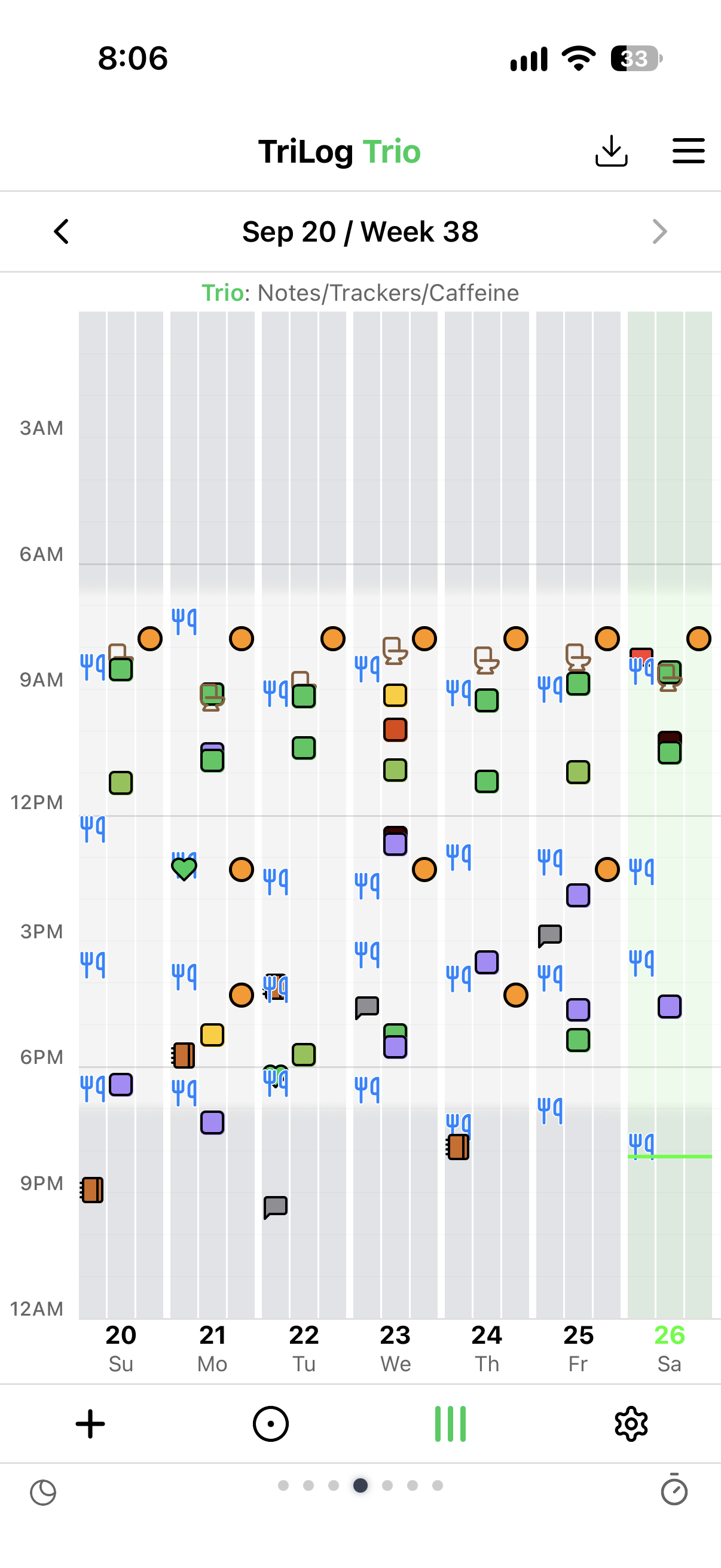
Tap the gear in its bottom bar to pick the columns. Your choice also sets the right side of the Day view, next.
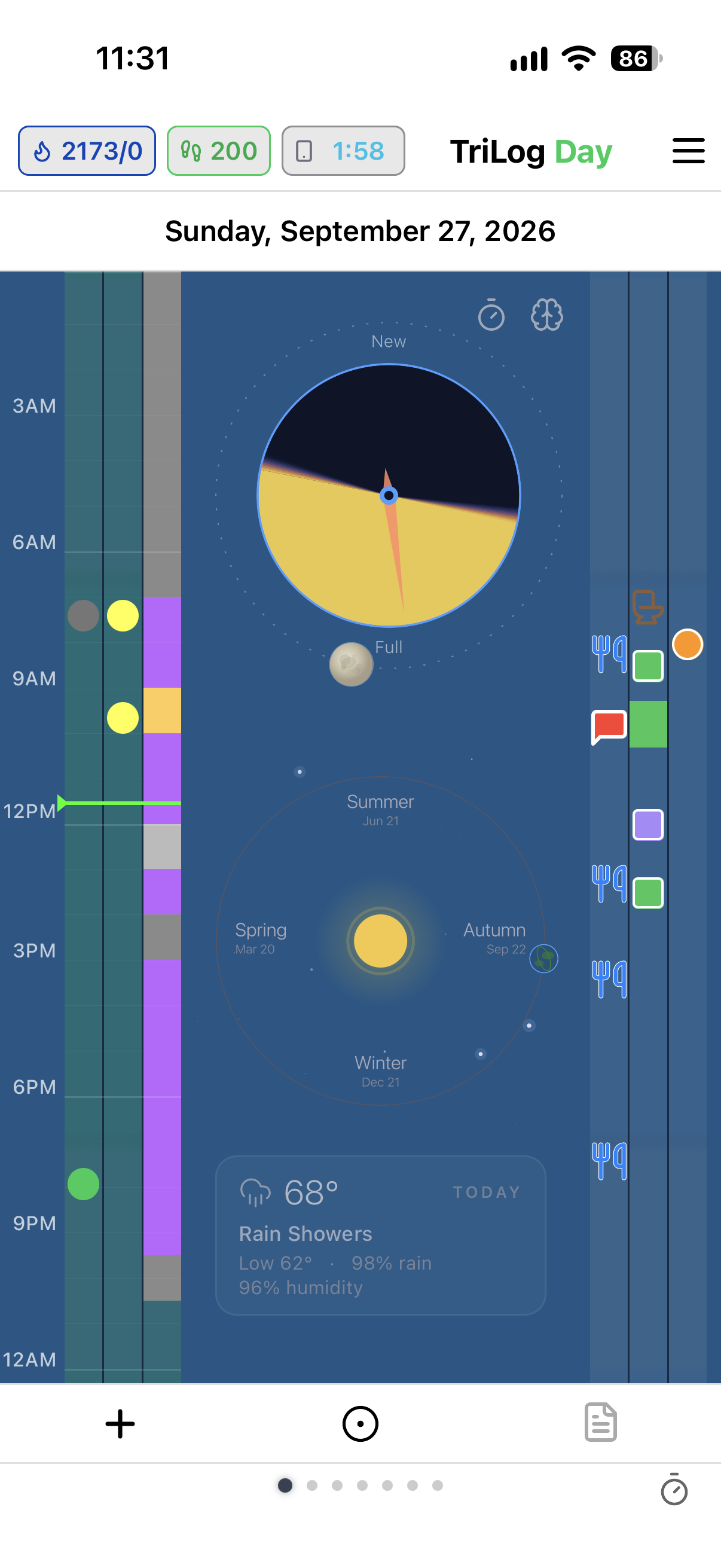
Day view. If you use TriLog a lot, you might want to focus on just today instead of the full week. The Day view shows today as columns around a sun clock: on the left, the main chart’s three (mood, energy, activity); on the right, your three Trio columns. The background changes with daylight. Tapping the sun pulls up an info page for the day — weather, pollen count, and other useful context.
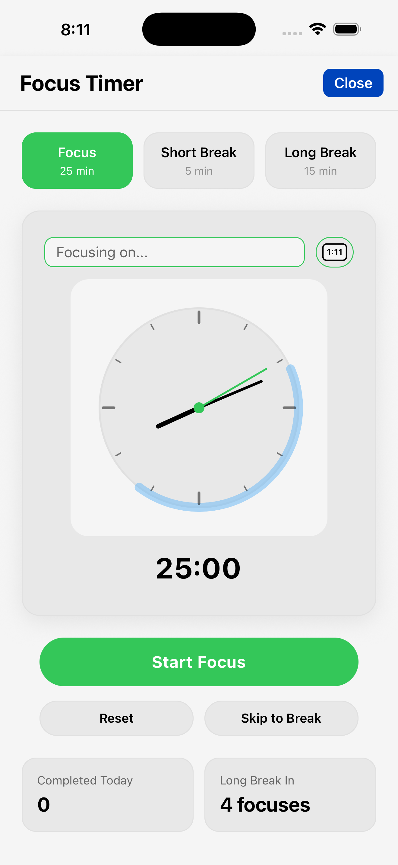
Focus timer. We have a work activity, but let’s drill down a bit and also track sessions where we’re getting focused work done. We’ll use the Pomodoro Technique — a 25-minute timer and a 5-minute break. Each focus session is counted, and the count shows in the metrics grid. Open it from App Menu→Tools→Focus Timer or the brain icon in Quick Track.
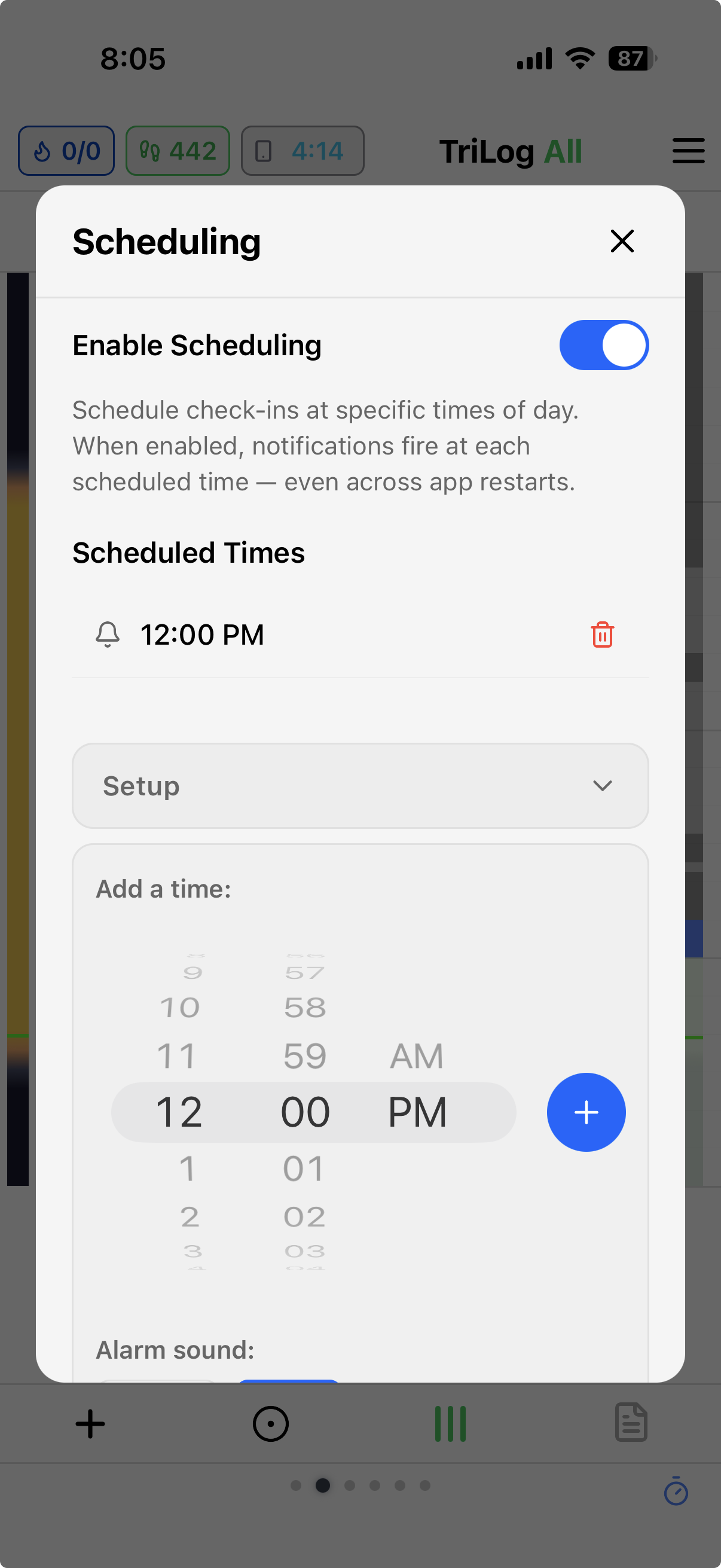
Scheduling. Check-in notifications at times you pick — morning, midday, evening. A nudge to log; nothing logs itself.
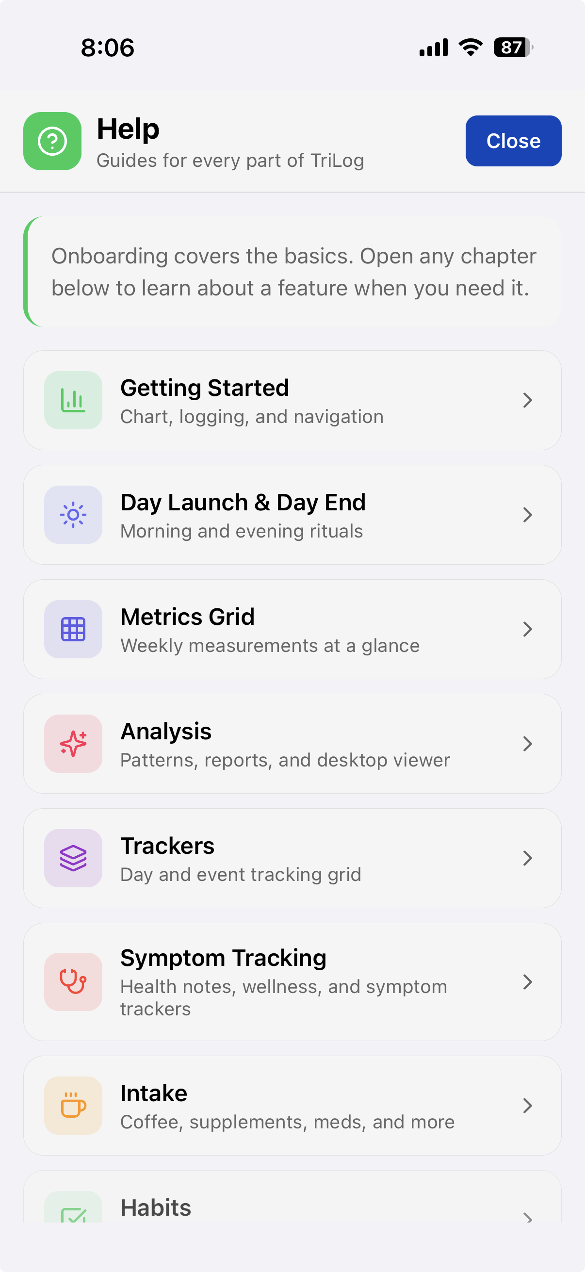
Help. A built-in guide — a chapter for every feature.
16The Data
So where are we going to store all this?
On your phone. Optionally backed up to your iCloud account. No account, no login, and no server that holds your entries — your log is only ever on your own devices. (Weather, pollen, and air-quality lookups go through a small TriLog service that only sees a rounded location.)
No ads. No corporations digging through your data.
You can export it anytime, in several formats — including one the open-source desktop viewer reads.
And because it’s all one log of plain lines, what you wrote stays readable no matter how the app changes around it.
What it costs. Everything is free for 30 days. After that, it’s $59.99 a year or $7.99 a month to keep logging. If you don’t subscribe, nothing is taken away: the app becomes read-only, and you can still browse, search, analyze, and export everything you logged, for as long as you like. One product — no tiers, no ads.
17Postscript
A few tips:
Questions? support@trilog.app
console.log for the mind
low friction input
dense visualization
Personal Data Logging with Analytics
· · ·
TriLog for iOS — on the App Store
Support · Privacy · Terms